Tony Albert Karen Black

Sam Jinks Dane Lovett
James Lemon Lara Merrett Yang Yongliang
SUMMER 2022

SUMMER 2022 Sullivan+Strumpf acknowledge the Gadigal people of the Eora nation, the traditional custodians on whose lands the Gallery stands. We pay respect to Elders, past, present and emerging and recognise their continued connection to Culture and Country. Editorial Directors Ursula Sullivan and Joanna Strumpf Managing Editor Alex Pedley Senior Designer & Studio Manager Matthew De Moiser Designer Ben Simkiss Proofreader Chloe Borich Mariia Zhuchenko Hannah Sharpe Production polleninteractive.com.au Advertising enquiries art@sullivanstrumpf.com or +61 2 9698 4696 Subscriptions 6 print issues per year AUD$120 Australia/NZ $160 Overseas SULLIVAN+STRUMPF Ursula Sullivan | Director Joanna Strumpf | Director SYDNEY 799 Elizabeth St Zetland, Sydney NSW 2017 Australia P +61 2 9698 4696 E art@sullivanstrumpf.com MELBOURNE 107-109 Rupert St Collingwood, Melbourne VIC 3066 Australia P: +61 2 9698 4696 E: art@sullivanstrumpf.com SINGAPORE P +65 83107529 Megan Arlin | Director, Singapore E megan@sullivanstrumpf.com @sullivanstrumpf @sullivanstrumpf @sullivanstrumpf sullivan+strumpf sullivanstrumpf.com FRONT COVER: Tony Albert, Remark Still Life #5, 2022 acrylic and vintage appropriated fabric on canvas board 51 x 40.6cm


SUMMER 2022 KARLA DICKENS EMBRACING SHADOWS 3 JANUARY – 12 MARCH 2023 | CAMPBELLTOWN ARTS CENTRE Located on Dharawal land, Campbelltown Arts Centre is proudly owned by the people of Campbelltown and is a cultural facility of Campbelltown City Council. Campbelltown Arts Centre is assisted by the NSW Government through Create NSW and also receives support from the Crown Resorts Foundation, the Packer Family Foundation and the Neilson Foundation. Image Credit: For Sale, 2022. Mixed media, 124 x 124 cm.
Image:
CURATED BY GLENN BARKLEY
10 DECEMBER –28 JANUARY
This homage to the Shoalhaven combines works by Barkley alongside artifacts, objects and pieces made by the community, transforming the Gallery into a magical, jewel-like space.

FREE ENTRY
Open Tue - Fri 10-4 & Sat 10-2 T. 02 4429 5444
Berry St NOWRA

5
Glenn Barkley, lyrebird stink bottle, 2022, earthenware, 11 x 10 x 5cm. Photograph by Aaron
Anderson.
Courtesy the artist and
Sullivan+Strumpf.
12

Dane Lovett Pearls (detail), 2022 oil and acrylic on canvas 120 x 100 cm Image courtesy the artist


New Beginnings
Ursula Sullivan+Joanna Strumpf
As we publish our last issue to close out 2022, it has seemed like a turbo-charged return to the fast pace and momentum of a prepandemic world. It was with much excitement that we recently announced the launch of our Melbourne space in November. We have been working with Melbourne artists, collectors and institutions since we first started Sullivan+Strumpf in 2005, so it is a natural and thrilling step to finally set up camp in one of our favourite art cities. The opening exhibition will be Tony Albert’s Remark, a stunning show which continues and expands his investigation into the work of Margaret Preston. Next year, the magazine will open with a closer look at the incredible Flack collaboration on the space, as well as our team and, of course, what our program and artists have in store!
Ahead of the well-earned summer break, however, we have much to see and read. We are thrilled to introduce emerging Melbourne artist James Lemon to the gallery; we have features on Lara Merrett, Karen Black, Dane Lovett, and Tony Albert marking the occasions of their long-awaited solo exhibitions. We look at historical works by Yang Yongliang; get a sneak peek into the studio with Sam Jinks; and Primavera curator Michael Do shares insights into the longrunning MCA showcase which features Julia Gutman. Finally, we present our Quick Curate: Summer Refraction, a summer-loving staff-curated show.
Enjoy, Jo+Urs
9
Tony
Albert Remark Aboriginal Glyph (detail), 2022 acrylic and vintage appropriated fabric on canvas 183 x 137 cm. Photo: Mark
Pokorny
SUMMER 2022


SUMMER 2022 74 31
Contents
Quick Curate: Summer Refraction
Introducing — James Lemon
Lara Merrett: By my side, walking
Karen Black: Gentle Pulse


Tony Albert: Remark
Dane Lovett: Here or Somewhere Like Here
Yang Yongliang: In Detail
In the studio with Sam Jinks
Last Word: Michael Do Up Next
11
12 16 22 34 46 56 66 76 80 84 49 36
Quick Curate: Summer Refraction
For this issue’s Quick Curate we conclude this year’s focus on light as it shifts through the seasons with Summer Refraction. With our growing team working hard in Sydney, Singapore and now Melbourne, it is a fitting time to cheekily put the notion to our team of glimmering light reflecting off the water's edge or refreshed skin, and hazy afternoons spent beating the sun or awaiting a mid-afternoon storm. Here we introduce Jenny Du, our new Sydney Gallery Manager, Tim Marvin, Registrar, and Mariia Zhuchenko, Sales Associate, and works that recall for them the light in these the longest, languid days of the year.
SUMMER 2022
Lynda Draper
Blue & White Vase II, 2022 ceramic, white glaze and lustre 53 x 27 x 33 cm

Photo: Simon Hewson
Grant Stevens Studio Meditation (9.21am, 22 February, 2018) , 2018 lenticular print mounted on alupanel 74.9 x 46.1 cm
Michael Lindeman
New Types of Art (Popular Outsider), 2021 acrylic and enamel spray paint on canvas 51.6 x 61.6 cm

Photo: Mark Pokorny
Jenny Du Gallery Manager

“Grant Stevens Studio Meditation series reminds me of phosphene. The swirling of colours behind your eyelids, particularly after sunbathing on a balmy summer’s day.”

13
Mariia Zhuchenko Sales Associate

“Like in Darren Sylvester’s Anytime But Now, summer to me is a staged set of saturated lights, coconut oil on sweaty skin, condensation dripping on my hand from a cold Aperol Spritz, and sea shells stuck to my sandy beach towel.”


SUMMER 2022
Angela Tiatia
The
Pearl, 2022 pigment print on 300gsm 100
x
80cm Edition
of 5 (#2/5)
Darren Sylvester Anytime But Now , 2014 lightjet print 120 x 90 cm Edition of 6 plus 2 artist's proofs (#3/6)
Glenn Barkley collage of imaginary pots , 2021 collage, synthetic polymer paint 76 x 56 cm Photo: Aaron Anderson
“As a group the works play on witnessing colour dispersion. Here, Sydney Ball and Seth Birchall address painterly variations of the same phenomena—one distilled, the latter figurative.”


15
Julia Gutman
I’ll be seeing you, 2021 assorted textiles and embroidery on wooden panel 62cm diameter Photo: Aaron Anderson Sydney Ball Chromix Lumina #12 , 2016 automotive enamel on aluminium 139.7 x 137.2 cm Photo: Courtesy Sydney Ball Estate
Seth Birchall
Fortunes Can
Change
, 2022 oil on canvas 152.5cm x 117 cm Photo:
Aaron Anderson
Tim Marvin Registrar
Introducing — James Lemon
By Ursula Briar
James Lemon’s work is creaturely. Artists love etymologies; it’s a way of turning everyday language into a found object. A creature is something that has been created, as in, I love all God’s creatures; so it first connotes a thing of design, before it passes into common usage to mean a living being, animal, or beast. In Middle English, it could mean a totality, the whole of the world. In contemporary speech, it carries a valence of creeping, goofy servitude, like an Igor or a love-struck idiot, as in, I am your creature. The Romans sometimes used it to mean a young child, which might also apply to Lemon’s work—a feeling of helplessness in the wake of vast, heaving networks of life.
Lemon’s work traverses—by way of hopping, crawling, flying, and squirming—the great gulf between the now and the horizons of the thinkable. If we can’t approach ecological catastrophe head on, Lemon’s work suggests, maybe we can burrow there. The result is intense, complex, obsessional. Painting, building, layering, glazing, and mark-making, Lemon’s work stages a hyperfixation, thinking beyond the box by chewing through the box, portending the future through intuitive, bodily gestures— like Nostradamus, but a termite.
SUMMER 2022
Portrait of James Lemon in his studio, 2022. Photo: Annika Kafcaloudis
+ EMAIL ART@SULLIVANSTRUMPF.COM TO REQUEST A PREVIEW


SUMMER 2022
James Lemon Resurrection, 2021 kiln brick, glaze, gold, enamel, mixed media 180 x 50 x 60 cm
Image courtesy the artist
James Lemon and Dale Hardiman self portrait chair (collaboration), 2020 pine, chipboard, paint and polyurethane 75 x 52.5 x 51.2 cm Image courtesy the artist
Lemon works out of his studio in Northcote, where he’s been located for the past three years. A whitewashed cavern stacked high with treasures, the floor space is occupied by half-finished sculptures, mounds of clay, gems and bricks, interrupted by a large, comfortable couch. The energy is both chaotic and cosy; studio visits are always welcome. This is the space in which he crafts his work and tutors both handbuilding and throwing. Lemon started his journey as a ceramicist in 2015, focusing on tableware. Interest in his work, primarily vessels, developed rapidly, culminating in an NGV commission for the 2018 Nendo x Escher exhibition collection. Since then, his practice has shifted to larger-scale sculptural projects, with recent works such as Kiln Brick Wall for Ace Hotel and Zoe for Craft Victoria representing a foray into more diverse materials and forms.
This creaturely work tries to catch a glimpse of non-human consciousness, a dot of light refracted in a compound eye. It speaks to intuition rather than logos—connecting with bodily senses, blurring of the human relationship to reality. Works such as LAMB SHANK are chimeric, at odds with the rigidity of fired ceramic: a stoneware vessel, formed on the wheel and turned with a circular saw, mounted on a plinth made of salt brick, with a glazed green lamb bone perched on its lip. There’s a joyful wrongness to this object; it’s somewhere between a cake, a kinder surprise toy and a lit cigarette, like West German fat lava mated with a rococo urn.
This category confusion is deliberate; Lemon works at high temperatures so the objects flex, warp and deform in unexpected ways. Some works are tortured like man-made
monsters, some are as finely wrought as a root system, and some, again, are distressingly human, blistered with heavy glaze and peeling like burned skin. Appetite always factors in, so the work is surreally located in the realm of both bug-eating and carnivorous insects, bug-eat-bug. Yet all this bug- and body-horror is somehow high-spirited; full of vibrating, beating wings, the play of light. The vessels are lively; their total asymmetry assures that the eye never rests in one place, and instead roves over the morphing and devolving shapes of alien eggs, ants, biblical figures, catfish, birds shot point-blank like revolutionary casualties. The logic of association, such as there is one, is textural.
Lemon repurposes objects, such as kiln bricks, at the end of their useful lives, converting the metaphoric into the material. This can be seen in works such as Kiln Brick Wall, which takes literally the very building block of western industrial expansion itself. There’s a tension between human technological development, design, and environmental concerns—his brick-based works are always in conversation with the visual language of rock formations, extreme weather degradation, volcanic activity—expressing a complicated love of energyintensive methods of production. This conversion of natural substances into productive materials intimates something spookier: a subordination of all stinging, flying, crawling things to the kiln.
Lemon’s use of colour, too, reconciles opposites—noxious greens are paired with fleshy pinks, competing primary colours, subdued jewel tones. Lashings of gold evoke a kind of perverted alchemy, as if precious metal were being turned back into base materials. In recent works, metals
19
predominate, invoking the spectre of luxury consumption, as in worm bowl, recently acquired by the NGV, or Zoe, a bronze swing half-melted, as if in a heatwave. This esoteric blend of visual associations is part of what makes Lemon’s work so compelling; the viewer thinks at once of the high Middle Ages, a grotto at the heart of an anthill, an alien invasion arcade game, a pimple.
All this registers as a frenetic resistance to anything that could be called an ‘argument’. Lemon’s work does not crudely address this or that calcified idea. It reminds us that art isn’t a form of action, but a form of knowledge. These works are knowing, though it is a creaturely knowledge: instinctual, ecstatic, and vital.
 + EMAIL ART@SULLIVANSTRUMPF.COM TO REQUEST A PREVIEW
James Lemon kiln brick table plinth 1 , 2022 kiln shelf, kiln brick, glaze and gold 19 x 61 x 41 cm Image courtesy the artist

James Lemon kiln brick table plinth 1 (detail), 2022 kiln shelf, kiln brick, glaze and gold 19 x 61 x 41 cm
Image courtesy the artist
21

Lara Merrett By my side, walking
Contemporary artist Lara Merrett and Curator and Executive Director, Artspace, Alexie Glass-Kantor met more than 25 years ago. Alexie first wrote about Lara’s practice in 1998 and the two have been both friends and peers ever since. This momentary extract comes from an ongoing conversation between the pair, now spanning more than a quarter of a century, here focusing on Merrett’s upcoming exhibition By my side, walking at Sullivan+Strumpf, Sydney.
Interview with Alexie Glass-Kantor
23
EXHIBITION: LARA
MERRETT,
BY
MY
SIDE,
WALKING, 20
OCT – 12 NOV
2022, S+S SYDNEY
+ EMAIL ART@SULLIVANSTRUMPF.COM TO REQUEST A PREVIEW
Portrait of Lara Merrett surrounded by her unstretched canvases, 2022.
Photo:
Jek Maurer
Alexie Glass-Kantor (AGK) / Lara, your practice has been built around a conversation with colour and a deep and unabating interest in how its direct affect and impact can create different forms of encounter, consciousness or awareness in audiences. Colour informs both the two-dimensional and expanded forms of your paintings, including the sculptural incursions that are a form of embodiment, of architecture in colour, and that invite participation. In the last five years your work has really undergone a transformation and is moving in new directions. So how do we find ourselves here today in beautiful Bendalong, on Yuin Country?
Lara Merrett (LM) / In the last five years my painting has certainly slipped off the stretched canvas and I have wanted to explore what the possibilities of painting were, for me. For it to become three dimensional, immersive and to engage with different architectures and possibilities of scale. It has also become a kind of sanctuary; I like being swallowed up by the work. That is the state that I find the most rewarding in creating and making. It might explain why there is such scale to the work lately. I’m also really interested in it overtaking spaces.
AGK / It’s an expanded encounter with the colour field. And the way you approach this encounter isn’t a passive form of action. Abstraction actually comes out of a lineage of social, cultural and political responses and is a radical way of thinking. Colour can be a radical form for encounter.

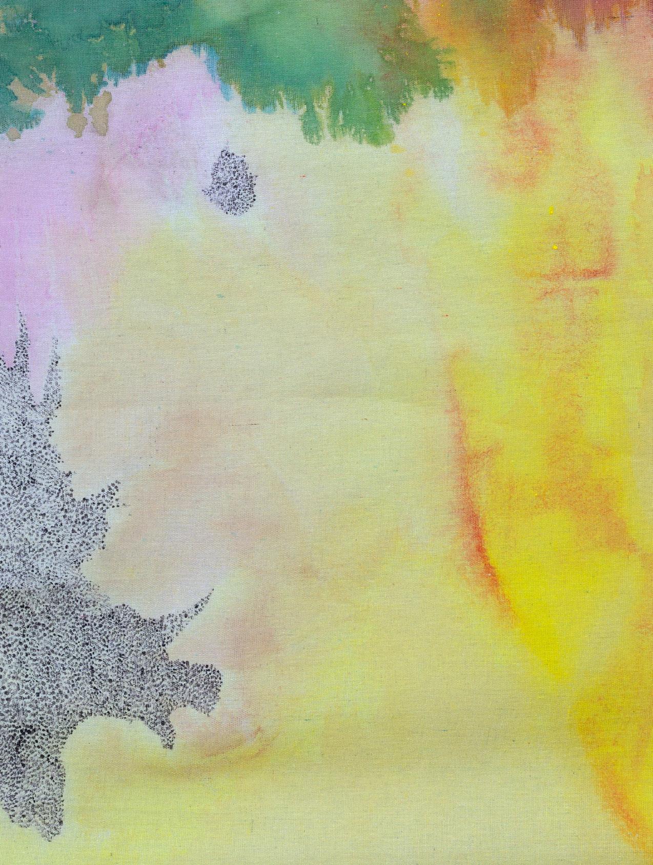
SUMMER 2022 Lara Merrett Standing still, 2022 ink and acrylic on sheer 100% cotton canvas and cedar stretcher 122 x 153 cm Photo: Jek Maurer

25

Lara Merrett Sitting out in the hours (detail), 2022 ink and acrylic on sheer 100% cotton canvas and cedar stretcher 150 x 225 cm Photo: Mark Pokorny
“I like to tap into where colour can take you to. As much as hearing the line of a song or the smell of something, I think the power of colour is on equal footing with those senses.”
LM / For me, it's colour as a language, I like to tap into where colour can take you to. As much as hearing the line of a song or the smell of something, I think the power of colour is on equal footing with those senses. So, I'm pushing that forward and taking it to the extreme... I want to know about every kind of yellow there is! The way I get there is not a logical process, it's through introducing chance, experimentation and thinking about where and when I make something. In my current works, I'm looking for the experience of being connected to nature and so here we are in Bendalong.
AGK / I remember a beautiful moment the last time I was here with you. Your paintings were lying directly on the earth and September sun was streaming in as you were sweeping off fallen leaves from the surrounding trees. Having known you for a long time, as you were standing there barefoot on the canvas, I could see that there was a shift happening in you and your relationship to your work.
LM / At that time, maybe due to home-schooling and being indoors all the time, there was just this hunger to be outside in the landscape. The 2020 bushfires had just hit, and everything around me was really charred and black. Everybody in the area was on the lookout for any wildlife that might come back. I felt like if I wasn't outside, I wasn't doing my job, which was to sight birds and to report. I was also running up the road, where we had these little bush feeding stations, because we wanted the kangaroos, goannas, the greater gliders, and all the animals to come to feed and breed.
So, there's always been a very practical approach to my work, if I'm outside doing this it's not just making, I'm doing other things. I needed to be watching, helping things. That was my role.

SUMMER 2022
Lara Merrett: By my side, walking, video produced by Sullivan+Strumpf. Videography: David Barker, ArtVid
Lara Merrett Running on the spot (detail), 2022 ink and acrylic on sheer 100% cotton canvas and cedar stretcher 122
x 153 cm Photo:
Jek Maurer

AGK / It’s so important that By my side, walking isn't about leading from the front or coming up the back, but creating opportunities to walk together, to be together, to cross thresholds together. At the entrance of Sullivan+Strumpf there is a beautiful large-scale installation-as-threshold. When visitors come into the gallery they walk under and through this structure. They decide to be complicit and engaged with the space, crossing into an environment of participation. There are many important lineages you are drawing from here in addition to the formalist concerns of colour field abstraction.
LM / We have spoken about transformation before. A big part of the new work is this transparency I created in the canvas, letting both light into the work, and letting audiences into them too. Looking beyond the canvas and seeing the structure beyond.
In my research for this show, I was looking to powerful structures and landscapes of transformational change. From protestors who have saved old growth forest creating the Conjola National Park, or helping local fauna feed and breed post-bushfires, they were all everyday actions by everyday people. The community of which I am part. The structures that support or result from these actions are really interesting for me.
One structure I came across in that research was the ‘tree-sit’. I mean, even just the words tree-sit, spark great associations for me. That to save a tree you must sit with it which implies time, collaboration and so much more than the structure itself. So, for the exhibition, I found a fantastic handbook that was made in the 90s. And basically, I think I've got it here, it's called The Earth First Direct Action Manual. I love it, it's like a ‘bible’ or manual of non-violent direct action. It’s basically for people who forest protest. It's a very practical guide, it's got how to tie knots, how to tree-sit. On one page, I saw a wonderful DIY on how to make a tree-sit platform which, interestingly for me, was the same scale as one of my paintings. So, I had this idea of having my stretched painting mimic this strategy. I love the idea that a painting, actually putting it in a forest in this way, could save a tree.
So, the platform becomes a painting and I have flipped it so that you can view the painting sitting down, or if you were lying on your back on the gallery floor and looking straight up. We're asked to engage in a different way then, which might make us think about connecting to the outside. Or bringing that connection inside. The platform is held up by a pulley and rope to a tree above, and then you've got this very simple but very effective way for a person to sit in a tree and mind it.
I have had a real curiosity, since working out in the elements, with the weather and time, to almost squeeze the colour out of what's already around me and doing that mindfully. So, I've been working with ochres from the Clay Cliffs of Washerwoman's Beach in consultation and collaboration with Yuin elders like Uncle Paul Jrumpinjinbah McCloud, who will work with me in creating a community workshop looking at the land, recuperating natural pigments which helps regenerate the landscape.
Washerwoman's Beach is only 500 metres from here, it’s really on my doorstep. There's just so much colour in the landscape, literally, from these incredible soft blushing pinks to reds and oranges. For a painter to come across this and realise there are histories here, of material uses across time, particularly in Yuin and other Indigenous histories of the area as well. It's a sacred material. Opening up conversation about learning how, and whether we can, work with these respectfully and with permissions has been wonderful and key in the selection of material and how it has been used. I have also been working with Joanna Fowles on the uses of natural dyes and Diego Bonetto on generative weeding practices postbushfires.
SUMMER 2022 Lara Merrett Makeshift moment underground, 2022 ink and acrylic on sheer 100% cotton canvas and cedar stretcher 122 x 153 cm Photo: Jek Maurer


SUMMER 2022 EXHIBITION:
LARA MERRETT, BY MY SIDE, WALKING, 20 OCT – 12 NOV 2022, S+S SYDNEY
+
EMAIL ART@SULLIVANSTRUMPF.COM TO REQUEST A PREVIEW
AGK / What is so pertinent is that the workshops may not necessarily find direct form in the exhibition, but they are the foundational structure of By my side, walking Interpersonal relationships and community are the scaffold, the provisional architecture that you are building. People need to come together to form and create, activate and resist – be it policies or interventions that undermine land, Country and care, or sustainability and its inherent capacity for resilience. Your practice is about investing in those relationships over the long term, not just at times of crisis but for healing too.
There is a beautiful book by Lori Waxman called Keep Walking Intently: The Ambulatory Art of the Surrealists, the Situationist International, and Fluxus, all about how walking is self-determination: you decide the direction you go in, what you encounter, how long you spend with something and when to walk away.

I love that this exhibition is an invitation for audiences to walk in through this threshold, into a space where material forms, which have existed in a state of flux and transformation, have found this propositional form through you. A proposition for the next act in the transformation of your practice too.
LM / Absolutely, I'm inviting collaborators and audiences to come with me in this process, and this space is open to everyone. Relationships need that space given over to them, it needs to be in the spirit of generosity, I feel, because that's what I've been given through my experiences, and I wouldn't have the work I have without having all these people by my side, walking.
33
Lara
Merrett High on a hill (detail), 2022 ink and acrylic on sheer 100% cotton canvas and cedar stretcher 122 x 153 cm Photo: Jek Maurer
Karen Black Gentle Pulse
How do we feel when we think about softness? Does the term delicate suggest weakness, or can it represent something more considered or generous? For her upcoming exhibition Gentle Pulse, Karen Black has been using words as triggers to shape her work, relishing in the potential for misunderstanding.
By Elyse Goldfinch
SUMMER 2022
EXHIBITION:
KAREN BLACK, GENTLE PULSE, 24 NOV – 17 DEC 2022, S+S SYDNEY + EMAIL ART@SULLIVANSTRUMPF.COM TO REQUEST A PREVIEW

Karen Black in her studio, 2022. Photo: Nic Walker

Karen Black After the rain comes the sun, 2022 oil on canvas 213.6 cm x 198.5 cm Photo: Mark Pokorny
Gentle Pulse begins with language. Taking words such as soft, delicate, gentleness and care as a starting point, the exhibition complicates their definition by focusing on what emotions they bring up, rather than what they represent. How do we feel when we think about softness? Does the term delicate suggest weakness, or can it represent something more considered or generous? Karen Black interprets words as triggers or principles from which to shape image, sculpture, light and tone. Relishing in the potential for misunderstanding, the words Black lingers on are elusive, open-ended and difficult to define.
Through the exhibition Black aims to rethink artistic practice as something that can be more open, more kind, more soft, more loving. These are not words commonly associated with the logical, rational art world but claim a different space. Radical care is a form of resistance against hierarchical and patriarchal convention. It requires slowness, consideration, community and strength. To strive for gentleness is a deeply personal and largely transformative philosophy for art and for life.
Gentleness is an active participant in the exhibition; a radical shift from the density of Black’s earlier paintings. The staging of those earlier works has been stripped away
to uncover something more primordial. Decelerating the process amplifies the softness of the artist’s brush. Intentionally slowing down the painting process, every layer is cleverly placed, with much of the canvas left blank. The negative spaces feel intensely vulnerable in their exposure, yet there is a staunch power in Black’s refusal to touch them. A physical and emotional void. In its presence and absence, the hand of the artist is tender throughout.
Held within the tension between the canvas and paint, Black presents whispers of things recognisable only through glimpses of shadow and shape. Interiors and exteriors bleed into one another, yet her use of framing in this body of work encloses the image. We see people trapped within the thresholds and boundaries of doorways and windows, but they remain porous, blurred. Each painting a memory of a memory, transforming hybrid images into a singular mis-on-scène. Embodied within the archaeology and layers of luminous surface, each character lays itself bare.
The scale of bodies is also unusual, in some they take up the entire canvas, where in others they are pushed to the edges. In one painting, a figure wanders into the frame, as if by accident. They are in a state of human-animal

37 Karen Black Crushed butterfly dream, 2022 oil on canvas 61.3cm x 46 cm Photo: Mark Pokorny
metamorphosis. Their face separates from their body, falling to the ground, as the head of a horse emerges atop their shoulder. In another, a figure appears on the ground with limbs flailing, possibly in the process of being crushed by the weight of a giant mass that takes up most of the canvas. Black describes this mass as a ‘vortex’. An energy field that can represent healing and self-exploration, and as a place ‘where the earth seems to be especially alive with energy’. So, is the figure being crushed, or are they in a state of becoming?
Bodies are fluid things, liquified through paint. Corporeal beings float along the surface of the canvas but are often disjointed and detached. Black takes exercise diagrams as reference material to examine how the body distorts when it squats, rotates and bends in unusual ways. Active poses captured and reassembled. No longer whole but precariously poised to adapt new forms. Limbs from one figure may actually belong to another, held within a distorted version of downward-facing dog. The representation of bodies continues in Black’s bronze and ceramic sculptures. These objects also resist traditional depictions of bodies with their torsos sliced and stacked atop unsteady bases. Genderless and unselfconscious, they fit together perfectly.
Rejecting a mimetic representation of the world, the paintings invite multiple readings. Always ambiguous and tenuous to grasp, each work a slow revelation of something else unexpected. The work engenders an unconscious bond between desire and repulsion, gentleness and strength, fragility and domination. Black forces her audience to recognise that we both
eroticise and are horrified by that which we don’t understand. Distorted faces and figures are either elongated or flattened beyond recognition. They should cause discomfort yet this is offset by the beauty in the colours and textures. Just when they could topple into transgression, Black pulls them back. These contrasts illuminate their own ambivalence, as the works never take a singular position. Instead, they recognise their inability to be defined. Like language, the paintings contain images that may be misinterpreted or misjudged, but they are incommunicable by nature—the misnomer is in the making.
SUMMER 2022
“Bodies are fluid things, liquified through paint. Corporeal beings float along the surface of the canvas but are often disjointed and detached.”
Karen Black
I will shade you from the world, 2022 oil on canvas 213.6 cm x 198.5 cm
Photo: Mark Pokorny


 Karen Black in her studio with works in progress, 2022.
Photo: Mark Pokorny
Karen Black in her studio with works in progress, 2022.
Photo: Mark Pokorny

SUMMER 2022
Mark Pokorny
The works contain simultaneously contrasting emotions such as seduction and violence, lust and foreboding. An internal matrix of human emotion takes effect, asking questions about what it is to relate to one another but also how we relate to ourselves. How we interact with those closest to us. How we stay vulnerable while protecting ourselves. The way we are entwined within these messy tangles of contradictions. Black asks these questions of herself too, alluding to self-portraiture and self-reflection throughout the body of work. The full spectrum of human relations is expressed through Black’s vision of the world, unearthed with paint, texture and material.
The exhibition begins as it ends—with words. Among the paintings and sculptures is a neon light that reads feelings, rendered in the artists’ own handwriting. Black is constantly unearthing new ways of using language in her practice, from the poetics of her artwork titles to the incorporation of text in her more recent exhibitions. feelings is directly lifted from one of Black’s many sketchbooks that she uses to constantly accumulate drawings and notes to herself and as prompts for her work. By transforming this abstract, fleeting thought into a neon light, she breathes new life into it.
The constant pulsating of the neon sits somewhere between a solid and gas, never fixed, yet given form. This pulse is a rhythm, a heartbeat, a steady vibration. It is a call for slowness, self-care and deep connection between the artist, the work and the audience.
43
Karen
Black Room for sentences, 2022 oil on canvas 61.3 x 46 cm Photo:
EXHIBITION:
KAREN
BLACK, GENTLE PULSE,
24
NOV – 17 DEC 2022, S+S SYDNEY
+ EMAIL ART@SULLIVANSTRUMPF.COM TO REQUEST A PREVIEW

Karen Black Losing my mind, 2022 oil on canvas 183 x 228.5 cm Photo: Mark Pokorny


Tony Albert Remark
Community, connection and collaboration are at the forefront of Tony Albert’s practice. As a cherished cultural leader, he is dedicated to mentoring upcoming artists and to remaining connected to Country and community. In August this year, he began mentoring two students through the City of Gold Coast Professional Placement Program. Students Lyle Duncan and Mikaela Evans sat down with Tony to chat about his upcoming solo exhibition.
47
Tony Albert Remark Still Life, 2022 acrylic and vintage appropriated fabric on canvas 183 x 137 cm Photo: Aaron Anderson EXHIBITION: TONY ALBERT, REMARK, 10 NOV – 10 DEC 2022, S+S MELBOURNE + EMAIL ART@SULLIVANSTRUMPF.COM TO REQUEST A PREVIEW
Tony’s highly anticipated solo exhibition Remark will launch the new S+S Melbourne gallery in November this year. 2022 has been a momentous year for the artist with two major public art commissions announced including a monumental 15-metre-long floating botanical sculpture, Inhabitant, which will welcome visitors at the entrance of the transformed Queen’s Wharf in Brisbane, and The Big Hose, an iconic outdoor play sculpture for QAGOMA which is being made in collaboration with artist Nell. Also unveiled in 2022, was Albert’s major commission for the new Allianz Sydney Football Stadium, a culturally informed design and artwork for the stadium’s seating. Remark continues Tony’s interrogation of the problematic use of Indigenous Australian iconography in domestic design and decoration. Incorporating fabric from his extensive collection of ‘Aboriginalia’, the new body of work sees Tony expand on his acclaimed Conversations with Margaret Preston series, critically engaging with the textiles in his own right.
‘Like the fabric of Australian society, the appropriated Indigenous imagery printed on souvenir tea towels intertwines in a complicated web of national identity. These are not images by Aboriginal people and our voices and autonomy continue to be silenced through the object’s inauthenticity’.
‘As a country we must reconcile with these objects’ very existence. They are painful reminders of a violent and oppressive history, but we also cannot hide or destroy them because they are an important societal record that should not be forgotten’.
“As a country we must reconcile with these objects’ very existence. They are painful reminders of a violent and oppressive history, but we also cannot hide or destroy them because they are an important societal record that should not be forgotten.”
SUMMER 2022

49 TOP LEFT Tony Albert Remark Still Life #5, 2022 acrylic and vintage appropriated fabric on canvas board 51 x 40.6cm Photo: Mark Pokorny TOP RIGHT Tony Albert Remark Still Life #8, 2022 acrylic and vintage appropriated fabric on canvas board 51 x 40.6cm Photo: Mark Pokorny BOTTOM LEFT Tony Albert Remark Still Life #4, 2022 acrylic and vintage appropriated fabric on canvas board 51 x 40.6cm Photo: Mark Pokorny BOTTOM RIGHT Tony Albert Remark Still Life #2, 2022 acrylic and vintage appropriated fabric on canvas board 51 x 40.6cm Photo: Mark Pokorny

SUMMER 2022
Mikaela Evans (ME) / This is your second iteration of the Preston concept. You seem to have pushed the ideas further than the last show, would you say this is correct?
Tony Albert (TA) / Yes, I think the first Preston show gave me a lot of confidence to look at the idea of appropriation and where this body of work could lead to. Not just now but also in the future. I felt there was a need to continue and push further.
Lyle Duncan (LD) / There is a sensitivity attached to the appropriation of indigenous imagery that comes across in your work. Is this because of a new contemporary context?
TA / We are so saturated by visual iconography. When I started this journey, I ended up having a lot more empathy and understanding about what Margret Preston was trying to achieve. I gained more insight into her thoughts and feelings. I wanted to be critical of the idea of appropriation while still paying homage to someone who I believe was an incredible artist, thinker, and person.
ME / There has been a bigger push of abstraction within this series. Do you feel you have discovered a sense of freedom with the imagery?
TA / That’s interesting, in terms of the idea of ‘freedom’ there was something in the process of making these works that became a lot more playful. Under the concept of ‘Remark’, I used the fabric more intuitively, cutting out and assembling the textiles in a unique way. The work comes from a very personal place, reflecting who I am and where my work is going. I feel there is an exciting evolution and growth in this show.
LD / It seems you use the past and reference ideals and visual iconography as a way of shaping today and tomorrow. Would you agree?
TA / Absolutely, one of my favourite quotes is from the late Charles Perkins ‘We don’t live in the past but the past lives within us’. I always think about how dynamic that is and how important it is for everyone to reach back into the past when looking forward into the future. The opportunity to do that within Australia, in the context of its colonial history, means that we get to reconcile with objects of the past. This is not only an important part of my practice but is an important part of both metaphorically and holistically moving forward, not just in an artistic way, but in life.
ME / Having the opportunity to engage with you in the studio and being able to see your studio practice has been so interesting. The abundance of your ‘Aboriginalia’ astounded me. Can you tell me more about the fabrics?
TA / My collection of Aboriginalia is extensive! I started it as a child. The number of objects often overwhelms people and the amount of ephemera in which Aboriginal imagery has been recreated is quite startling. The COVID-19 lockdown gave me the opportunity to go through my collection and engage with the abundance of fabrics. There is a fragility to the fabric which means I haven’t previously incorporated it into large installation works.
51
Tony
Albert Remark Christmas Bells, 2022 acrylic and vintage appropriated fabric on Arches paper 154 x 104cm
“The work comes from a very personal place, reflecting who I am and where my work is going. I feel there is an exciting evolution and growth in this show.”

LEFT Tony Albert Remark Wheel flower and Gumnuts, 2022 acrylic and vintage appropriated fabric on canvas 300 x 200 cm Photo: Aaron Anderson RIGHT Tony Albert Remark Wheel flower, 2022 acrylic and vintage appropriated fabric on canvas 300 x 200 cm Photo: Aaron Anderson

TA / During lockdown, I was able to experiment with new ideas especially around the theme of appropriation. As a collector there is something very cathartic about utilising all the objects within my practice and I’m so grateful the fabric has found its way into my work.
LD / Mikaela and I had the opportunity to see some of your work at Sydney Contemporary and noticed there is an incredible conceptual shift when work leaves the studio and is hung within the framework of a commercial gallery. Do you think about how each work will be experienced by audiences?
TA / It’s a bit of a double-edged sword for me. Over the years, I have found it’s better not to dwell on things you can’t control, so the moment an artwork leaves the studio it also leaves me. Focusing on the future home of an artwork can become convoluted or difficult. In saying that, the presentation and representation of my artwork is important to me. I am often involved in the commercial presentation of the works, but I have generally learnt to relax and know there are other people whose job it is to complete that side of the practice. By keeping this in mind, I have become far more open to relinquishing control of the works.
LD / Given the conceptual push in this exhibition, do you have any thoughts or ideas about the continuation of appropriation in your work in the future?
TA / Since 2015 and having travelled internationally, I’ve looked back conceptually at a lot of my work that I don’t feel was quite as resolved as I would like it to be. I think there are ideas that I would like to push further. I now have the confidence to go back to those ideas and look at them again. In the early stages of my career, I was compelled to transform my work with every show and try something new. Whilst I don’t think anything is ever over in my practice, I have a lot more comfort in teasing things out to their extremity. So, I don’t think this is quite over for me, but I am always looking at different ideas for the future.

SUMMER 2022
Tony Albert Remark Abstract I, 2022 acrylic and vintage appropriated fabric on canvas 200 x 300 cm Photo: Aaron Anderson
EXHIBITION: TONY ALBERT, REMARK, 10 NOV – 10 DEC 2022, S+S MELBOURNE + EMAIL ART@SULLIVANSTRUMPF.COM TO REQUEST A PREVIEW

55

Dane Lovett Here or Somewhere Like Here, 2022 oil and acrylic on canvas 180 x 150 cm
Dane Lovett Here or Somewhere Like Here
Melbourne/Naarm-based artist Dane Lovett is well-loved for his beguiling, delicate and meticulous approach to mark making. His new exhibition, Here or Somewhere Like Here at Sullivan+Strumpf builds upon this with compelling new forms of growth and development in his approach and methodology.
By Tess Maunder
bit.ly/dnlovett
57
EXHIBITION: DANE LOVETT, HERE OR SOMEWHERE LIKE HERE, 6 OCT – 12 NOV 2022, S+S SYDNEY + TO SEE AVAILABLE WORKS BY DANE LOVETT ACCESS THE VIEWING ROOM BY ENTERING YOUR EMAIL ADDRESS
At once nostalgic and contemporary, Lovett is known for his refined and controlled, yet teetering-on-pseudogrungy approach to painting. He produces swarming monotone palettes which focus on timeless memento mori motifs such as still-life flowers, pollen and grass. However, don’t be fooled, the work is not as straightforward as a photorealistic depiction of flowers on canvas. No, usually the imagery depicted is done so for both its universal and individual candour, alongside an energetic and experimental approach to both image-making and depth.
Casually obsessive is how I would describe Dane Lovett’s approach to practice to date, indeed, the artist merges what we might describe as a hazy, misty or even veiled, formal realist technique, with a limited and refined palette to flatten the field. The work is further complicated through his approach to portraying depth, he obscures either the foregrounds or backgrounds, altering between these in different works and through this, the artist obscures a ‘true’ perception of depth. Through doing so, the artist demonstrates his agility as a painter, and his capacity for building intrigue with audiences.
Here or Somewhere Like Here is the culmination of a season-long slog focusing on experimentation and play conjured up from the depths of winter in Lovett’s studio. Indeed, scale is of particular importance in this exhibition where we see not only the size of the works increase, but so too, a focus on what we might describe as microscapes, zoomed-in and cropped snapshots of the moments of the everyday: grass, flowers, but not as you have seen before. The movement of wind in blades of grass has been captured with a moody depth, conveyed through darker colours, almost like night-vision, ultraviolet or infrared.
This reduction in palette removes a lot of the context of the imagery and instead, I think, builds greater tension in the work. It leaves audiences thinking, ‘does this remind me of something familiar and earthly, or is it interiorly alien? Everyday mundanity or science-fiction? Innocent or sinister?’ It is almost like we are witnessing the subject in the depth of night, and with this comes a psychological tension. This tension is brought to the fore by the binary nature of colour depiction used by the artist. The use of a reduced palette with a focus on contrasting vivid blue and bright yellow reminds me of course of Yves Klein but also artists like Italian painter Rudolf Stingel, Swiss artist Pamela Rosenkranz, and even early works by Australian artist Linde Lee, each exploring the intensity present in focusing on a depiction of blue.
“does this remind me of something familiar and earthly, or is it interiorly alien? Everyday mundanity or science-fiction? Innocent or sinister?”
SUMMER 2022

59
Dane
Lovett Pearls, 2022 oil and acrylic on canvas 120 x 100 cm

SUMMER 2022
Dane Lovett Alta Vista , 2022 oil and acrylic on canvas 180 x 150 cm

61
Dane Lovett
Mercy and Clover, 2022 oil and acrylic on canvas 200 x 160 cm
 Exhibition view of Dane Lovett, Here or Somewhere Like Here, Sullivan+Strumpf Sydney.
Photo: Aaron Anderson
Exhibition view of Dane Lovett, Here or Somewhere Like Here, Sullivan+Strumpf Sydney.
Photo: Aaron Anderson


SUMMER 2022 Dane Lovett Gabber Gabber Gabber Apocalypse, 2022 oil and acrylic on canvas 200 x 160 cm
But perhaps even more interesting is the way that Lovett’s work draws some parallel to the limited colour palette use in film, seen through such legends as Wong Kar-wai, JeanLuc Godard and Jordan Cronenweth, each has explored the way that a limited palette allows audiences to not only respond to the intended mood of a scene but also take in a range of other sensory details that may be lost in the oversaturated depiction of the world that we are used to.
Often, the gaze or pictorial approach is from above, perhaps alluding to Lovett’s own moments of encounter in his everyday actions such as walking to and from the studio, no doubt, part of the artistic process. When visiting Lovett’s studio, I asked if the works were indeed meant to be depicting somewhere specific, or nowhere at all. He smiled and said that it wasn’t necessarily his intention to highlight a specific space or place and that ambiguity is the intention, a universal relatedness. He did say though that some of the inspiration for this body of work has come from walking, as a personal relationship with the landscape, or as an everyday means of daily transport. This is alluded to by the title Here or Somewhere Like Here, which connects us to the everyday and relatable aspect presented in these mini scenes. Walking as an intellectual or artistic practice, as we know, has a deep art

historical presence, enabling moments in time where the public has had access to freely move in public space. This is seen by Dadaist excursions in the 1920s right through to contemporary artists today including Janet Cardiff, Richard Long, Regina José Galindo and the Long March Foundation, among many others: walking is rich stimulus.
Earlier works by the artist included desirable yet straightforward abstracted figurative work, responding to ‘the everyday’ as seen through the artist’s city dwelling, urban lifestyle and interests. For instance, earlier work saw still life arrangements from indoor plants and pop-cultural ephemera—VHS cassettes, vinyl records, CDs, ageing tech, all painted in a wide palette and in true saturation. Then, as time went on, the palette reduced and, as more time went on, the depth of the painting reduced to a sophisticated, resolved and characterised methodology and approach by the artist. Most recently, the artist has developed a disciplined, restrained and at times unconventional approach to palette, which has made engaging, compelling and original work that truly sets him apart.
65 Dane
Lovett
Gabber
Gabber Gabber Apocalypse
(detail), 2022 oil
and
acrylic on canvas 200 x 160 cm
EXHIBITION: DANE LOVETT, HERE OR SOMEWHERE LIKE HERE, 6 OCT – 12 NOV 2022, S+S SYDNEY
+
TO SEE AVAILABLE WORKS BY DANE LOVETT ACCESS THE VIEWING ROOM BY ENTERING YOUR EMAIL ADDRESS bit.ly/dnlovett
Yang Yongliang In Detail
Yang Yongliang is a master of transformation, turning skyscrapers, office towers and factories into bucolic scenes from traditional shan shui (mountain, water) ink painting. Trained in traditional painting and calligraphy before studying at the China Academy of Art in Shanghai, his work tells the story of China’s recent rapid economic transformation but tinged with nostalgia for a slower, simpler time.
By Susan Acret
SUMMER 2022
EXHIBITION: YANG YONGLIANG, 7 – 15 JAN 2023, S+S SINGAPORE + EMAIL ART@SULLIVANSTRUMPF.COM TO REQUEST A PREVIEW

Yang Yongliang A Bowl of Taipei No.4, 2012 UltraGiclee print
Courtesy Yang Yongliang
Studio

SUMMER 2022
Yang Yongliang A Bowl of Taipei No.4 (detail), 2012 Epson UltraGiclee print Courtesy Yang Yongliang Studio
China’s transformation from a largely agrarian, poor and uneducated population into an urban, upwardly mobile, educated society has wrought massive change over the last three decades, producing opportunities for many, but leaving millions behind. The economic boom and its skyscrapers, office towers and factories have swept away much of old China and its traditions with breathtaking speed, a little like one of Yang Yongliang’s surging, threatening rivers. Yang’s practice takes up the recent story of China, and indeed the contemporary world, calling into question ideas of progress and looking back nostalgically to a slower, simpler time.
Yang’s digitally collaged photographs, his lightboxes and videos, virtual reality pieces, ink paintings and immersive installations often take as their foundation scenes from traditional shan shui (mountain, water) ink painting and its stories. Trained in traditional painting and calligraphy before studying at the China Academy of Art in Shanghai, Yang transforms the ideals of the literati genre, with its retreat from society and quiet contemplation of nature, through his use of digital media and the imposition of urban scapes. High-rise buildings, construction vehicles, and powerlines now scar once untouched natural vistas – we glimpse a site of industry in the pristine mountains, rivers dammed or diverted. Environmental destruction is a key concern in Yang’s works, and while the artist might implicitly acknowledge the impossibility of the literati ideal today, he seeks to bring the meditative balm of its philosophy into our fractured, difficult present. In acknowledging the loss of an artistic practice and cultural tradition, and of the natural realm that has long been a source of inspiration for artists, a wistfulness lingers alongside concerns for our present and future.
69
“Environmental destruction is a key concern in Yang’s works, and while the artist might implicitly acknowledge the impossibility of the literati ideal today, he seeks to bring the meditative balm of its philosophy into our fractured, difficult present.”
In Yang’s transformed landscapes he warns that the human world has exceeded its boundaries: in Artificial Wonderland II – Taigu Descendants, 2016, once rocky mountains have become a collage of precarious skyscrapers that threaten to topple over, while in the distance—in the past—unspoilt mountains can be glimpsed through cloud. In the series Heavenly City, 2008, everything has been swept up like a magician’s trick in a tornado held together by whirling cloud and dust. The city strains towards the heavens until its inevitable destruction in something that resembles a nuclear explosion. Artificial Wonderland II – Wintery Forest in the Night, 2014, features digital replicas of two Song Dynasty master paintings – Travelers Among Mountains and Steams by Fan Kuan and Wintery Forest in the Snow (anonymous). In Yang’s Wintery Forest in the Night the forest is now one of seductive sparkling city lights among skyscraper mountains. Despite the artificial nature of the scene – a geographically impossible collage – it evokes the contemporary metropolis: beautiful but unsatisfying in its promise of material satisfaction.

SUMMER 2022
Yang Yongliang Vanishing Landscape Shanshui No.1, 2016 mixed media on canvas Courtesy Yang Yongliang Studio
“Despite the artificial nature of the scene a geographically impossible collage it evokes the contemporary metropolis: beautiful but unsatisfying in its promise of material satisfaction.”

 Yang Yongliang Beneath the Sky, 2017 painted vintage Japanese silver paper
Courtesy Yang Yongliang Studio
Yang Yongliang Beneath the Sky, 2017 painted vintage Japanese silver paper
Courtesy Yang Yongliang Studio


Yang Yongliang Heavenly City—A Cloud on The Horizon, 2008 ink-jet print on Epson fine art paper 95 × 100 cm Courtesy Yang Yongliang Studio
In referencing the literati painters of the past Yang also draws on centuries of Chinese culture, stories and myths where gods ruled in a hierarchical and structured world. Rather than critiques of modernity, Yang’s works appear as philosophical ruminations on the folly of human traits such as greed, bad judgement and selfishness, which create imbalance and sometimes destruction. His vistas illustrate the human world in vain competition with nature and often hell-bent on their own demise too.
Yang’s digital reworking of master paintings and their mystical, symbolic landscapes also highlights ideas around the aura of the original and of reproduction as homage. Traditional Chinese painting students would copy master painters’ works as a form of study and a mark of respect.
Yang’s referencing of this practice adds historical layers and meaning while his use of other traditional cultural touchstones also make connections with the past. Work such as Beneath the Sky, 2017, an ink painting on silver paper, is presented in a large-scale traditional concertina-book format. In Bowl of Taipei, 2012, the artist serves up Taiwanese scenery resembling the scholar’s rock in traditional porcelain bowls, linking the physical and cultural spheres in a satisfying meal. For Vanishing Landscape, 2015, Yang mixes cement with acrylic paint, evoking the landscape painting tradition through a distinctly contemporary material: in a reversal of his video and digital image narratives, here the mountains are revealed through the use of concrete.
As a contemporary artist, Yang works with contemporary media and with a postmodern mindset, but the thread that tethers his work to the past is an ink line that creates a depth of perspective and time beyond the glittering surfaces of his dark twenty-first century visions.
75
EXHIBITION: YANG
YONGLIANG,
7 – 15 JAN 2023, S+S
SINGAPORE
+ EMAIL ART@SULLIVANSTRUMPF.COM TO REQUEST A PREVIEW
In the studio with Sam Jinks
Ahead of the artist’s debut solo exhibition at the new Sullivan+Strumpf Melbourne gallery in February, 2023, internationally recognised sculptor Sam Jinks talks to Sullivan+Strumpf’s managing editor Alex Pedley, to give us some insight into the resurgence of the ‘Hyperreal‘.
Alex Pedley (AP) / Rendered in excruciatingly real and tender detail, your sculptures often represent beings, human and non-human, in various states of life and death. They illicit incredibly visceral responses. Is realism for you, especially in three-dimensional form, a mechanism to bring object and audience into something of a metaphysical encounter—with self, with mortality? Has this changed over time for you?
Sam Jinks (SJ) / Historically I have used realism because I grew up illustrating and sculpting in this fashion. I later found there was an empathy generated within the viewer that was useful to encourage a deeper understanding of the work. It also means the viewer brings their own life and experience, so I often find the work takes on an entirely different meaning to the one I have. Sculpture is what I have worked in the most. I enjoy the physicality of it, it can require a lot of movement from the artist and there is an energy it brings. The viewer is cohabiting the room with its presence. With painting, the image is still ‘other’. I feel, as humans, we often forget the fundamentals of life, the experience of being an animal roaming the earth for a finite period. Societally, we get caught up in the details, the day-to day. I think it's important to be reminded of the rhythm of it all, the natural process of life.
SUMMER 2022
EXHIBITION: SAM
JINKS,
16 FEB – 11
MAR 2023, S+S MELBOURNE
+ EMAIL ART@SULLIVANSTRUMPF.COM TO REQUEST A PREVIEW

Sam Jinks Seated Woman, 2022 silicone, ground pigment, hair 31 x 47 x 73 cm Edition of 5 plus 2 artist's proofs Photo: Mark Pokorny


SUMMER 2022 Sam Jinks Seated Woman, 2022 silicone, ground pigment, hair 31 x 47 x 73 cm Edition of 5 plus 2 artist's proofs Photo: Mark Pokorny
Spending more time in nature has been a great help for me to see the constant cycle of birth and dissolution. It's easy to look at one as bad and one as good, but it's all part of the same.
AP / Your works, all bodies in various forms, seem to reach out and speak body-to-body, as it were, with our own. Audience consideration feels central to how you make work, is communicating via the languages of the body a way for you to connect with audiences?
SJ / I’ve used the body in many sculptures because the body has a language of its own. It can communicate through empathy and shared experience. It mirrors us, so when I come up with an idea, the pose and condition will have a meaning directly related to the work.I often have figures at the beginning of life and figures much later in life. To combine them suggests a cycle, a constant birth, dissolution and rebirth. It can also be interpreted as the same figure holding themselves at a different stage of life. This can often be felt relating to our own children and parents. It's as if we are again experiencing our own youth and also our old age when we are around them. When using animals or hybrids in work I’m usually suggesting some base instinct or unconscious behaviour. Much of human behaviour is not based on logic but irrational reactions. This is very prevalent in personal relationships.
AP / The materiality of your works is often a surprise for people after their initial encounter, it quite literally stops audiences in their tracks. From expert conservator to passer-by, all are fascinated with how you create such ‘fleshy flesh’ (technical term) in resin and silicone (the human hair of course helps!). Has the landscape changed over the years in terms of products available, and future proofing capacities, both in the field and your work specifically? These beings feel so fragile, but they are actually quite robust, aren’t they?
SJ / When I started, I used building materials, whatever I could to get the translucent appearance of skin, which was usually caulking silicone. But as time has gone on, materials that are easier to use have come along. Techniques have changed a lot, but the desire remains the same. To make something that goes beyond its material origins and gives a little peace and understanding to what it is to be a human. The last few years have been a testing period for me, not only regarding the pandemic, but literally a period of testing materials and futureproofing the process. It’s been many years since I made my first sculptures and within this time period, and some discussion with peers, I think the technology is now well understood.
AP / Audiences instinctively talk about Duane Hanson, John De Andrea, Ron Mueck, or even Maurizio Cattelan when they see your work. In fact, you have often shown in various exhibitions over the years together, and you are currently showing in ‘Hyperreal’ which has been touring the globe for nearly a decade in various iterations. However, this isn’t the first wave of the ‘Hyperreal’ zeitgeist, is it?
SJ / There is a long history of embellishing sculpture with details that suggest life. The Kritios Boy from early the Greek-classical period is an example of a work that shifted the early more rigid forms into a body in contrapposto; a more naturalistic form that brings all the elements of the body together. I think there is a fascination with this because it’s a preserved reflection of ourselves. It gives an opportunity to look deeply into the experience of another without having to engage.
AP / In realist sculpture, or the ‘hyperreal’ as it has become known, one of the great fascinations lies not simply in the virtuosic technical execution, but rather in what that almost total simulation of the real, although inanimate, does for reconciling us with concepts of our own mortality and the modalities of lived experience. Your new works seem to take this to a whole new level, can you tell us a little about what is happening in the studio?
SJ / The studio is somewhat chaotic at this point as I’m at the final stages of making work. This period is less about the ideas and much more the technical, but most of the work emerged from outside the studio. A number of the new works are encounters in nature that demonstrate the rhythm I mentioned earlier. The renewal of life from disillusion, or from decay in some cases. I’ve been drawn to this as it seems to create balance that gives some comfort to me, a circular aspect that has been a regular theme in the work since I began, but this time, it feels a little clearer.
79
EXHIBITION: SAM JINKS, 16 FEB – 11 MAR 2023, S+S MELBOURNE + EMAIL ART@SULLIVANSTRUMPF.COM TO REQUEST A PREVIEW
Last Word:
Primavera 2022 has arrived at the Museum of Contemporary Art in Sydney and has been organised by Michael Do, Curator of Contemporary Art at the Sydney Opera House, Australia, and Curator of Projects at Auckland Art Fair, New Zealand. For this year’s iteration, Do looks through the lens of the global pandemic and widespread social upheaval to a new generation of artists drawing upon mediums from choreography to moving image, to refocus our attention to the here and now.
Alex Pedley sits down with Michael ahead of the exhibition's November opening.
SUMMER 2022
Micheal Do, Sydney Opera House, 2022. Photo: Daniel Boud PRIMAVERA 2022: YOUNG AUSTRALIAN ARTISTS, 4 NOVEMBER SUNDAY 12 FEBRUARY 2023


SUMMER 2022
Julia Gutman in her studio with her Primavera work in progress, 2022.
Photo: Simon Hewson
Alex Pedley (AP) / What brought you to Primavera 2022, and how were you brought on board for the upcoming iteration?
Michael Do (MD) / Primavera: Young Australian Artists has supported and profiled some of Australia’s most thought provoking and interesting artists and curators. The possibility of curating the exhibition began in 2021 with a series of conversation and correspondence with Dr. Lara Strongman, Director, Curatorial & Digital, Museum of Contemporary Art.
Through our exchanges, she impressed the importance of realising the exhibition that I desired, encouraging me to colour the exhibition with my interests and worldview. It was a pleasure to dream up a hypothetical exhibition which we then gradually brought to life over the past 12 months, bit by bit, artist by artist, artwork by artwork, wall text by wall text.
AP / Primavera has a long legacy, what is it that is special about this particular exhibition for you?
MD / Yes, as you say, Primavera contains the added element of its own deep and rich history, its own successes, its own failures, along with all the personalities and actors involved along the way. This brings with it expectations. There’s a significant legacy to consider, to work with and to work against. This has been an intriguing consideration during the exhibition’s development. It’s certainly weighed on me.
But the artists and I have responded by remaining authentic to ourselves, to our practices and to each other. It’s really the only response—not to get carried away with Primavera fever—the sense of what the exhibition should look, sound, feel like. That’s biggest pleasure throughout this whole process—working with the artists, authentically and honestly, to tell their stories.
AP / And what is it that you’re bringing to this iteration and what can we expect to see that maybe we haven’t yet seen? What has been your Primavera process? Most importantly who can we expect to see in this iteration? What works are you really excited to see come to life?
MD / Much of my practice works with embodied practices, or live art. In my work at the Sydney Opera House, I work with artists to stage performances or events that are innovative and exploratory. These projects upon performance traditions, like theatre, choreography, sound and moving image, but aren’t necessarily recognisable as traditional performing arts.
I’ve taken these elements (ideas of audience experience, ephemerality, documentation, theatre-making) as provocations to the artists—asking how they might translate these considerations into the exhibition. I think the result will be an exhibition that has a slightly different relationship to its audiences—including the compliment of activations and performances, which for me, complete the exhibition experience.
AP / What are some of the biggest challenges in curating a showcase such as this?
MD / Exhibitions have so many moving parts to them. As you consider and decide on each element, the decisions made along the way can sometimes take you further away from your original idea and intention. I sometimes welcome this, as everything needs to be iterated, but occasionally the gaps between intention and execution are dissatisfying.
It’s not necessarily a challenge per se, more of a personal mantra that I remind myself with every project—have a sense of where you wanted to go, where you’re going, and where you’ll end up. Sometimes that pathway is straight and narrow; other times, it involves a 36 hour stop over somewhere.
AP / Finally, a favourite moment in the lead up so far?
MD / Purple cat (it’s an insider’s joke).
83
SAM JINKS Melbourne February 2023

HIROMI TANGO Sydney February 2023

GLENN BARKLEY Sydney February 2023


RAMESH MARIO NITHIYENDRAN Melbourne March 2023
DARREN SYLVESTER Sydney March 2023
SUMMER 2022 Up Next
Natalya Hughes
The Interior This forthcoming publication explores interrelated strands in the artist’s recent practice that reappraise male modernists Freud, Kirchner, and de Kooning and their complex female subjects.
The Interior is designed by EviO Studio, Sydney and will be published by the Institute of Modern Art, Brisbane in October 2022.
Institute of Modern Art 420 Brunswick St Fortitude Valley QLD ima.org.au
Available for pre-order: shop@ima.org.au
This project has been assisted by the Australian Government through the Australia Council, its arts funding and advisory body. The IMA is supported by the Queensland Government through Arts Queensland, the Australian Government through Australia Council for the Arts, and the Visual Arts and Craft Strategy, an initiative of the Australian Federal, State, and Territory Governments. The IMA is a member of Contemporary Art Organisations Australia.


85
Glenn Barkley
SHOP NOW
In+Store:

SUMMER 2022 earthenware, dimensions variable Artist books, clothing, gifts and little art available for pickup or delivery from the online store: bit.ly/ssgallerystore
87 SULLIVAN+STRUMPF Ursula Sullivan | Director Joanna Strumpf | Director SYDNEY 799 Elizabeth St Zetland, Sydney NSW 2017 Australia P +61 2 9698 4696 E art@sullivanstrumpf.com MELBOURNE 107-109 Rupert St Collingwood, Melbourne VIC 3066 Australia P: +61 2 9698 4696 E: art@sullivanstrumpf.com SINGAPORE P +65 83107529 Megan Arlin | Director, Singapore E megan@sullivanstrumpf.com


