OCTOBER 2020
Michael Zavros Joanna Lamb Polly Borland Juka Araikawa Alex Seton Sam Jinks
FRONT COVER: Michael Zavros, Dad likes Summer, 2020, lightjet print, 172.7 x 122 cm
ARCHIBALD PRIZE
OCTOBER 2020
24
12 32
Contents
08 12 24 32 42 50 54 56 58 66
On Reflection Polly Borland: Strange Desire Joanna Lamb: Perceiving the Familiar Michael Zavros: A Guy Like Me In the room next to yours: Juka Araikawa At Home with: Alex Seton In the Studio: Sam Jinks Quick Curate: Reverie Last Word: David Flack Upcoming Exhibitions
56
5
Polly Borland, Morph 12, 2018 (detail), archival pigment print. Dimensions variable
7
OCTOBER 2020
On Reflection Ursula Sullivan+Joanna Strumpf
The unexamined life is not worth living they say. But to truly examine who you are — your identity and your place in the world takes courage. To do it publicly and in the wildly heretical way Michael Zavros has done in his upcoming exhibition, ‘A Guy Like Me’ requires something else altogether. We are all willing voyeurs to this examination of self, and cannot look away from these deeply unorthodox but seductive images. Presented as a series of eight photographs, this exhibition will disrupt the idea of Zavros as a painter and bring into question ideas of masculinity, fatherhood, desire and the individual pursuit of perfection. Focusing less on the self and more on the body, Polly Borland’s work also explores desire, but from a very different perspective. Pip Wallis – curator of Borland’s sublime survey exhibition, Pollyverse held at the National Gallery of Victoria in 2018 – discusses the development of her practice and the knife edge Polly balances on between the physical and psychological, comedy and drama, confinement and freedom.
Michael Zavros Dad likes Mercedes, 2020 lightjet print 172.7 x 122 cm
We dive deeper into the work of Joanna Lamb and Juka Araikawa, consummate observers of their surroundings. Although their work is very different, both are deep meditations on the everyday and seem particularly relevant now in our empty streets and endless nights at home. We drop-in on Alex Seton to admire his growing art collection and hear what’s for dinner — it sounds amazing! And we visit Sam Jinks in the studio — where, in amongst the fume cupboards and clay he still makes room for a nap. Finally, our beautiful friend and interior architect David Flack of Flack Studio has the last word on Disney and how a family movie favourite unexpectedly lead to one of his great epiphanies of 2020. Enjoy! – Ursula and Joanna
9
Barbara Cleveland
Opening 6pm, 9 oct. 9 oct. – 14 nov.
Thinking Business +Gallery 2: Alana Cappetta
Barbara Cleveland,
This is a stained glass window
, 2019, Production still. Image courtesy of the artists and Sullivan+Strumpf.
Open Mon–Fri 9–5, Sat 12–4 Closed Sun and Public Holidays Civic Centre, 184 Bourke Street Goulburn NSW 02 4823 4494 artgallery@goulburn.nsw.gov.au goulburnregionalartgallery.com.au
Kirsten Coelho
Kirsten Coehlo creates functional forms and vessels of otherworldly perfection. In Kirsten Coelho, the first major publication on a practice spanning thirty years, author Wendy Walker traces the evolution of Coelho’s textured practice, in which an ever-expanding framework of art historical, literary and cinematic references has driven a succession of formal shifts – a shaping of changes. This beautiful, lavishly illustrated book of 176 pages will be released in September 2020. For pre-orders and enquiries, please contact publisher Wakefield Press at info@wakefieldpress.com.au or phone +61.8.83524455.
Polly Borland: Strange Desire Polly Borland creates images that render the body alluring, enigmatic and absurd, inviting audiences to see the human form in unfamiliar ways. In this edited extract, Pip Wallis, NGV Curator of Contemporary Art chats with Borland about her NGV exhibition in 2018. Interview with Pip Wallis
+ TO SEE AVAILABLE WORKS BY POLLY BORLAND, ACCESS THE VIEWING SPACE BY ENTERING YOUR EMAIL ADDRESS
TO SEE AVAILABLE WORKS, ACCESS THE VIEWING ROOM BY ENTERING YOUR EMAIL ADDRESS + Polly Borland Untitled (Nick Cave in blue wig), 2010 Type C photograph Dimensions variable
13
LEFT: Polly Borland,
Morph 12, 2018 archival pigment print Dimensions variable RIGHT: Polly Borland
OCTOBER 2020
Morph 8, 2018 archival pigment print Dimensions variable
15
Polly Borland: Strange Desire
Pip Wallis (PW)/ Thinking about your new series MORPH, is this work a continuation of your series Smudge and Monster or is it more of an amalgam of all your past work? Polly Borland (PB)/ I think it’s an amalgam. I think that in all my series, one thing leads to another, everything feeds into each other; it’s a progression. Conceptually and visually, it’s definitely a continuation but also a body of work that can exist as itself.
PW/ In all your previous work you play with a combination of the abject and desire; an unsettling ugliness as well as a libidinal quality. It seems to me in MORPH you’ve taken this combination further. PB/ Interestingly, I see this body of work as the most beautiful. There were initially two inspirations that I was working with. One was the last image of Monster – that big red piece. It was the starting point for this next body of work. The other inspiration was the stocking cases, which I’d never worked with before, that had their own organic quality, which gave a bit of a direction through the raw material. There were also some visual ideas in my head: the dream sequence in Dumbo, where Dumbo gets drunk with the mouse, and some of Australian painter Tony Clark’s earlier Chinoiserie landscapes, and Dr. Seuss.
OCTOBER 2020
I feel that Untitled XXXII is one of the most successful works in the Smudge series because it relies on its shape and the face marks are literally smudges, like the series title, while being classical and modernist in its simplicity. Recently, I haven’t used wigs or identifiable props like in the other Smudge works. The new series was an endeavour to reduce visual language. I was aiming to abstract but at the same time conjure a kind of mythical dreamlike state. I think I was successful in that but
interestingly, the more I went along, the more figurative the images became. At first, I was creating preconscious images and now I look at it there are sort of mythical monsters; some of them are a bit monstrous, almost touching on horror. But because of soft textures and the colours they also have a friendly seductive quality and are quite compelling because the work has a modernist kind of classicism to it – the centred framing. It’s appealing to the eye.
PW/ You talk about the preconscious and I’ve been thinking about whether you have an interest in psychoanalytic perspectives and how the work can tap into unconscious associative thinking. PB/ Definitely. It’s become more and more prominent or I’ve become more and more conscious of it as I’ve gone along. Preconscious and unconscious are two different things, because unconscious is something that’s locked into your non-memory whereas the preconscious is about to become articulated. When I started thinking about preconsciousness, I was interested in the pre-language; almost in the womb. Recently Sibylla Phipps, who is the model inside the costumes in MORPH and who has studied psychoanalysis, mythology and the demonisation of females in film, wrote an incredible essay about my work. Interestingly, she analysed it from a human point of view, whereas I would like to think that actually the work kind of transcends the human combined with deeper research into a specific genre. The comical yet critical text drawings in the series announce the passing of various art movements and other absurd considerations of the art world. I compile pages of notes in preparation for each drawing, then carry out a process of editing and formatting to arrive at a piece of writing to be translated into a newspaper classified drawing.
Interview
Polly Borland Her Majesty, The Queen, Elizabeth II (gold), 2001 Type C photograph Dimensions variable
17
Polly Borland: Strange Desire
LEFT: Polly Borland
Untitled XXX, 2010 chromogenic print Dimensions variable RIGHT: Polly Borland
OCTOBER 2020
Mouth, 2017 archival pigment print Dimensions variable
PW/ The body is perhaps less cohesive and stable than we’d like to think, in terms of the way that writers like Donna Haraway have thought about how the body is subject to things like technological change and medical intervention. We’ve started to understand that the barrier between the human body and the rest of the world is more unstable than we previously thought. Is MORPH responding to issues of today or does it feel more routed in mythical and classical themes? PB/ I think it’s more mythical, classical and primal, but having said that I’m very aware of the impacts of, for example, iPhones being the extension of our bodies now. So we are cyborgs and my work is infused with an existential awareness. We’re under threat; I don’t see our way out of this. When I was growing up there were threats like the atom bomb and other fears to keep everyone in check. But it feels to me like we’re really under threat now, particularly in that the technological age has completely distorted ethics as we’ve known them. The genie’s out of the bottle and unfortunately, I can’t see how we’re going to survive as a species. I’m feeling pretty desperate, particularly for my son.
Interview
It’s a misconception that globalisation has homogenised everything; it’s actually social media, the internet and algorithms that we are being manipulated by because algorithms have in-built biases, so discovery and choice is now an illusion.
19
Polly Borland: Strange Desire
PW/ It’s interesting to think about how these fears are playing on your mind while you’re making this work, and although your work has never been didactic or overtly political, you can still feel that sense of anxiety. PB/ I’ve never been afraid of that darkness. I think all my work has had darkness, even when I wasn’t feeling as worried about humanity.
PW/ When you’re in the studio with the model how much of an impact does your relationship with the model have on the work? PB/ With Smudge you can really see that each person gives their own ambience, but Sibylla, the model in MORPH, approached me after seeing a work from Smudge. She said what had attracted her to my work was that there was the sexual language and the way I depicted the female not through the male gaze.
PW/ How do you see yourself in relation to the politics of feminism? Is this body of work particularly interested in the female body?
OCTOBER 2020
Polly Borland Untitled XXXII, 2010 chromogenic print Dimensions variable
PB/ I think of myself as a humanist. I’m a visual artist and language has never been my main interest. I believe that language is used to confine people – and particularly now language is very important, and young people really understand the power of language, yet you’ve got people in power who don’t care about the impact of their words, which incite hatred. The liberal culture in certain Western countries is being threatened and there are conflicts around freedom of speech and of course you can’t censor the internet, yet it is a place of some horrible things: the information war, child pornography and so forth. I believe in freedom, but freedom that actually allows people to be who they are and freedom that promotes – it sounds very hippie! – love and kindness. I don’t see a lot of that in government policies around the world right now; it says a lot about humanity’s lack of compassion. I grew up being taught by my mother and father that society should care for those who are struggling.
Interview
Polly Borland Morph 7, 2018 archival pigment print Dimensions variable
21
Polly Borland: Strange Desire
PW/ You’ve been living in the United States for seven years now and there’s been a lot of change in the last couple of years. The concerns that you’ve talked about just now have become more and more pressing. How has living in that context impacted your work?
OCTOBER 2020
PB/ I’ll tell you exactly how. When I first began living in Hollywood, in LA, I felt gagged. I realised that there were not a lot of truth tellers, that there was not a lot of honesty. Hollywood permeates Los Angeles and you know, a lot of it is smoke and mirrors, that’s how Hollywood has been built. Feeling like I couldn’t speak and that I was being suffocated gave me anxiety, but then I realised, slowly, it’s made me stronger as a person because suddenly I started to find my voice again and now I feel like I can speak my truth. I think Los Angeles has created some of the best artists in the world. Paul McCarthy and Mike Kelley are artists that I’ve always admired and loved. The Mike Kelley retrospective at the Museum of Contemporary Art (MOCA) in LA blew me away. He was a genius and so much of his work was very unsettling, and I don’t think it was a coincidence that he and Paul McCarthy came out of LA. I think it had to do partly with the environment that they were in. That’s what artists do, they soak up their environment.
PW/ How has your use of photography as a medium shifted over time? PB/ I fell in love with taking photos, but the only reason I picked up the camera was because I didn’t feel I could draw or paint. I loved art history and my teacher at the hippie school I went to said, ‘Why don’t we build a darkroom in the cupboard?’ and basically I’ve been taking photos ever since. The way I approached photography was much less about documentation; there was definitely an element of that, but it was more about me reordering space, creating my own thing. Where I want to go next is towards creating sculptural forms. What you see in MORPH is very sculptural and I imagine exploring another medium in which to create those figures. ‘Interview with Polly Borland’ by Pip Wallis, first published by National Gallery of Victoria, Melbourne, ngv.melbourne/essay/interview-with-polly-borland, 24 Sep 2018
+ TO SEE AVAILABLE WORKS BY POLLY BORALND, ACCESS THE VIEWING ROOM BY ENTERING YOUR EMAIL ADDRESS
Interview
Polly Borland Morph 6, 2018 archival pigment print Dimensions variable
23
Joanna Lamb: Perceiving the Familiar Joanna Lamb’s paintings continually question the idea of the familiarity of the everyday things you see. The highlyrecognisable nature of the subject matter opens a dialogue with the audience which results in the viewer’s ongoing entanglement with the artist’s vision.
By Dr Kevin Robertson
+ TO SEE AVAILABLE WORKS BY JOANNA LAMB, ACCESS THE VIEWING ROOM BY ENTERING YOUR EMAIL ADDRESS
Joanna Lamb Industrial Streetscape, 2019 acrylic on super fine polyester 122 x 152 cm
25
Joanna Lamb: Perceiving the Familiar
OCTOBER 2020
Joanna Lamb portrait. Photographer credit: Tanita Seton
I
magine that your car turns mistakenly into an unknown street, somewhere in a light industrial zone. You are late for an appointment, but instead of becoming stressed, you stop to look at the arrangements of the roller-doors, footpaths, coloured concrete render and lawns and notice the way the shapes of things are locking together. As you disappear into observation and become less anxious you realise that your thoughts are balanced by a sense of stillness, quietness and neutrality. This is where Lamb’s paintings come to mind as a comparative experience through your memory and how they affect the way you read these everyday scenes. Your mind flicks between the two things, her paintings and the street’s vista, comparing and then merging them. Rather than assert the identity of the painter, her paintings assume the opposite position, that of an unseen author, and in this painter/viewer dyad, you interact with the painter. A similar thing occurs with painters like Edward Hopper, Jeffrey Smart or Clarice Beckett, whose works also deal with familiar imagery and provide a counterpoint to your perception of the familiar. Lamb has worked steadily in Australia for several decades, producing fresh, crisp, images of urban centres and in particular of her home city, Perth. The shifts in her working methods are inventive and subtle. Sometimes the paintings exist directly on the wall itself rather than occupy the frame. At other times her paintings transform into collages or become tiled into fragments of Laminex. The paintings are matt acrylic and therefore without surface reflection. This reinforces the quiet and fixed quality, which is also gently asserted by the absence of brushstrokes.
There is a strong continuity in the works – that reminds us we are always dealing with the same unseen author. The artist is also, most often, invisible in an emotional sense. By avoiding a tactile technique, her work bypasses the ongoing romantic ideas of expression and the ego of the artist. Instead she retreats to her suburban studio, the antithesis of the inner-city loft. Lamb draws subjects from her surroundings, attracted to their obviousness and generic nature. A pigeon noticed on the ground, a view from a cave in a park, anything may become a subject. These things are seen by the artist as both nostalgic and current. They are then pocketed and taken back to the studio for analysis. There are no restrictions on her methods, digital media also assists in burying the identity of the artist. The sharply imaged outcome, held together with tonality is always the main game, unencumbered by painterly ideas of “touch” and “trace”. You, as a viewer, provide the missing subjective element and decide how these things affect you. Lamb increases the acuity of her palette with every new painting. The colour mosaic in her work is continually refined. You see a blue shaded window frame, giving depth to a perfectly rendered sky reflection as in a recent work Apartments 012020, while the high pitch of tone in the ubiquitous orange tiled roof, recesses in space behind these elements. Her naturalism in colour is increasing to an astonishing degree and very few artists are even close to her in this respect presently, yet her work always remains a measured distance from realism.
27
OCTOBER 2020 Joanna Lamb Apartment 012020, 2020 acrylic on board 46 x 61 cm
29
Joanna Lamb: Perceiving the Familiar
LEFT: Joanna Lamb
Industrial Streetscape 2, 2019 acrylic on board 156.5 x 126.5 cm
OCTOBER 2020
RIGHT: Joanna Lamb Streetscape, 2019 acrylic on board 94.5 x 125 cm
As Australia now exists inside a perfect bubble, Lamb’s paintings could be seen as a metaphor for, or even a premonition of this. There are no people on the streets in these works. Occasionally figures are depicted as shapes in dense public spaces in her paintings, but not as distinct individuals, rather as mere accessories to the architecture. In current times everyone is forced to look again at what is right in front of them, at their own streets, in their lounge rooms and on their walls, as much as they are dreaming of travel overseas or looking at screens. Lamb’s paintings reflect this close, localised scrutiny. Through her paintings, she carefully and slowly takes note of her experience. This close scrutiny sets in motion a process for the artist that results in the experience being transferred into a meticulously precise, 2D geometrical equivalent of it, rather than a direct, mimetic account. At times though, there are evocations of emotion in her painting. A stark branch or an intense highlight on a car window is a reminder that pathetic fallacy is possibly just below the surface in her work, ready to break through the opacity of colour, disrupting the tight analytic structure of the compositions.
The cycle between detachment and then restricted emotional engagement with everyday landscape is ongoing in Lamb’s painting. The changes in the painter’s attitude to her subject from one painting to the next are micro-expressions and therefore difficult to detect. This air of control is what gives you the viewer, the space to make a comparison to your own sense of familiarity with these scenes, which often results in a feeling of balance. Lamb enables this exchange of experience, through things she has noted and recorded in these wonderful, intelligent, super-observed paintings. Dr Kevin Robertson is an artist and a sessional academic at Curtin University, Perth
+ TO SEE AVAILABLE WORKS BY JOANNA LAMB, ACCESS THE VIEWING ROOM BY ENTERING YOUR EMAIL ADDRESS
31
Michael Zavros: A Guy Like Me By Independent Writer and Curator Hamish Sawyer
OCTOBER 2020
“If there was another me, what would he be like? Better. Younger, like I used to be. 6 ft 3, broader, fit and really ripped. Smooth like a Classical Greek statue. He wouldn’t drink. A perfected human, but like a placeholder. Melancholy and distant with resignation. I’d call him Dad, that strange word that replaced my name and in some ways replaced me.1”
+ TO PREVIEW THIS EXHIBITION BY MICHAEL ZAVROS, ACCESS THE VIEWING ROOM BY ENTERING YOUR EMAIL ADDRESS
Michael Zavros Dad likes Thomas, 2020 lightjet print 172.7 x 122 cm
33
Michael Zavros: A Guy Like Me
M
OCTOBER 2020
ichael Zavros is one of Australia’s most celebrated contemporary artists. His exacting, hyper-realist paintings of luxury fashion goods, thoroughbred horses and classical interiors have brought the artist critical and commercial acclaim and are as coveted as the objects they depict. Despite the success of these works, or perhaps because of it, Zavros has gradually shifted focus over the past decade, drawing on his own life and family as the principle subjects for his recent paintings. That the artist has been able to pivot towards more autobiographical content is due in part to his growing public profile. Zavros’ success has afforded him a visibility rare for an Australian artist. He is regularly photographed at the opening of art exhibitions and luxury fashion boutiques and has been the subject of numerous magazine features, often accompanied by images of the photogenic artist and his family at their Brisbane home. Zavros shares studio shots of his paintings, often featuring cameos by his children, with 91,000 (and counting) Instagram followers. The artist’s life has become synonymous with his art to the extent that the two are now indistinguishable. As the New Zealand curator and writer Robert Leonard has observed: ‘He is his own consummate artwork’.2
Zavros’ paintings have an unavoidable relationship to photography. First time viewers marvel at the artist’s technical facility, wondering aloud if the work is in fact a photograph. His earlier paintings often adopted the aesthetics of advertising. It was perhaps inevitable then that the artist should begin working directly with the medium. Over the past five years, Zavros has produced a number of photographic self-portraits that play with the conventions of the genre. In Portrait with Sean O’ Pry Zavros cast the American Gen Y model and Instagram star as a substitute for himself. The artist posed the model against a neutral backdrop wearing a white T-shirt emblazoned with ‘Zavros’, evoking the look of a fashion editorial. In this work, the artist’s surname becomes a brand to be worn, or perhaps more accurately, consumed, like one of his desirable paintings. A Guy Like Me represents Zavros’ most significant photographic project to date, further collapsing the boundaries between the artist’s life and work. Once again, the artist has used a surrogate, this time a male mannequin whom Zavros has named ‘Dad’. The artist purchased a commercial model online, sculpting a head for the mannequin by hand, which he then had scanned and 3D printed. Zavros’ facial features and hair were airbrushed onto the cast by a specialist car detailer, to
Michael Zavros Dad likes Colour, 2020 lightjet print 172.7 x 122 cm
35
OCTOBER 2020
Michael Zavros Dad likes Greece, 2020 lightjet print 172.7 x 122 cm (detail above)
37
Michael Zavros: A Guy Like Me
the artist’s specifications. ‘I went shopping for the body I wanted’, he wryly notes.3
OCTOBER 2020
Zavros dressed ‘Dad’ in his own designer clothes and aviator sunglasses, and staged the mannequin in a series of situations that would be familiar to anyone who follows the artist’s work or his social media; ‘Dad’ with his vintage Mercedes-Benz; ‘Dad’ with his horse, Thomas. Other images engage with the persona that Zavros has carefully crafted through his work. Dad likes Colour for example, in which the shirtless mannequin reclines on a sun-lounger, his eyes covered by cucumber slices, riffs on the artist’s vanity as portrayed in paintings such as Bad Dad 2013. Images from A Guy Like Me premiered in The Australian newspaper’s glossy monthly magazine Wish earlier this year, illustrating a story about the future of fashion retail. Superficially at least, it’s a fitting context for these images; a seamless integration of Zavros’ image, lifestyle and art. Yet, as with all of the artist’s work, there is more going on beyond the surface of these photographs that warrants closer attention. In Dad likes Winter, the mannequin is pictured with the artist’s children at Main Beach on the Gold Coast, where Zavros was born and raised. The artist’s two daughters are
posed alongside ‘Dad’ wearing casual, beach-y clothes in matching pale tones. Zavros’ son wears a vintage blue and white ‘key’ knit over his shoulders, a reference to the artist’s Greek heritage. ‘Dad’ is pictured in a similar geometric knit, unbuttoned, placing the mannequin’s abs on prominent display. Far from being a natural, family photo, the image is highly choreographed. Printed largescale for exhibition, the photograph reads as a billboardready advertisement for the artist’s lifestyle. What, if anything, does Dad likes Winter reveal about the artist himself? Is he a bad parent for using his kids as props in a photo? Or are they just playing to the camera because that’s what their father asked them to do? The work doesn’t offer up any clear answers. And that’s the point. Zavros loads his images with autobiographical and intertextual references that seek to distract from their artifice without giving too much away. The shadow of another figure is visible in the lower right corner of Dad likes Winter: that of the artist himself, taking the photograph. By inserting himself in this way Zavros reveals the constructed nature of the image, and the series as a whole. The artist’s use of a mannequin also obviously renders the work fictional. For all of the care and precision that Zavros exerts in creating his seductive images, ‘Dad’
Watch Michael Zavros at home with A Guy Like Me
is resolutely a shop mannequin. Although it speaks to the artist’s interest in the tropes of luxury fashion and visual merchandising, it is curious that Zavros, an artist known for his hyper-real images, has chosen such a hokey standin for himself. In Dad likes Summer, the viewer’s eye is immediately drawn to the join between the mannequin’s neck and head; and the airbrushed highlights on the model’s hairline are so noticeable as to be comical. These seemingly minor yet deliberate details reveal the futility of the artist’s stated intention of creating ‘a better version of me’.4 It is interesting to consider Zavros’ images in relation to the contemporary photographer Cindy Sherman. Since the late 1970s, Sherman has produced a coherent but continually evolving body of self-portraiture using costumes, make up and disguises to inhabit various character types, from film stars to clowns and socialites. Through her images, Sherman has become one of the most recognisable artists in the world, yet she remains largely unknowable. The assumption that in presenting her own likeness, Sherman’s images somehow contain the artist’s ‘true’ self is too simplistic. Art historian Abigail Solomon-Godeau has instead posited that:
“The material presence of the author/artist/subject is by no means identical to their existential presence. Hence the suggestive aspect of the use of body doubles as it operates to destabilize notions of the unique individual”.5 Similarly, by using a stand-in for himself, Zavros implicitly acknowledges that his photographs are not self-portraits; rather they represent a character the artist has cultivated through his art and public life over the past two decades. Few have mastered the performative aspect of being a contemporary artist as deftly as Zavros. A Guy Like Me offers up the aspirational lifestyle of a successful artist, one who knows exactly how much to reveal; and in such a way that his viewers will undoubtedly return for more. 1. Michael Zavros, ‘A Guy Like Me’, Sullivan + Strumpf promotional video, 2. Leonard, Robert ‘Michael Zavros: Charm Offensive’ Art & Australia Vol 49, no.1, Spring 2011 https://robertleonard.org/michael-zavros-charm-offensive/ 3. Email from the artist to the author 30/08/20 4. Email from the artist to the author, 08/07/20 5. Solomon-Godeau, Abigail “Body Double” Photography after Photography: Gender Genre, History, (ed. Sarah Parsons) 2017, Duke University Press, Durham and London, p.180.
+ TO PREVIEW THIS EXHIBITION BY MICHAEL ZAVROS, ACCESS THE VIEWING ROOM BY ENTERING YOUR EMAIL ADDRESS
39
OCTOBER 2020
140 x 210 cm
Michael Zavros Dad likes English Red, 2020 lightjet print
41
In the room next to yours:
Juka Araikawa By Ang Kia Yee
“I had always found it unpleasant to have guests in my apartment. They filled up my rooms with strange sentences I would never have formulated in such a way. Today I found the sound of these sentences particularly unbearable. Sometimes I tried to follow only the sense of the conversation so as not to hear the sounds of the language. But they penetrated my body as though they were inseparable from the sense.”
OCTOBER 2020
– Yōko Tawada, Where Europe Begins
TOP: Juka Araikawa
Swamp, 2018 Oil on canvas 127 x 96.5 cm BOTTOM: Juka Araikawa at
her studio. Image courtesy of Juka Araikawa
43
In the room next to yours: Juka Araikawa
J
uka Araikawa is an artist who, in her own words, “Captures figures in dream-like yet also uncannily familiar environments”. This description clings as one looks at her paintings, which employ gouache and oil on canvas, and watercolours and monotypes on paper. They are at once recognisable, as though drawn from the viewer’s memory, as well as unplaceable, forming worlds just out of reach.
evoke story, relationships, and action. And despite the gentle colours and soft shapes she seems to gravitate towards, dramatic tension is enacted by the dissonant co-existence of the familiar and unfamiliar. It prompts the viewer to ask: Where did these figures and objects come from? What are they doing together? Why are they here and, actually, where is here? Why, despite everything, do we feel so strange and foreign to each other?
This practice of looking at the familiar as though outside of or alien to it seems to extend from Araikawa’s life into her paintings. Born in 1984 in Yokohama, Japan, Araikawa attended an international school, which made her feel like a foreigner, especially because she didn’t have Japanese friends. “I kind of had this way of looking… like from an outsider’s point of view,” she says in a 2013 video interview. Yoko Tawada, whose writing tugs at the strangeness of language and itself as a derivative of that strangeness, comes to mind, as does Haruki Murakami. Besides straddling languages and cultures, home and foreign environments, both Tawada’s and Murakami’s writings, like Araikawa’s paintings, convey an interest in the ways we co-exist and interact while remaining alien to each other.
Regarding her process, Araikawa says, “I usually start with really small sketches, and I use a projector to project these really simple sketches. And then I try to figure out how to translate it on a bigger surface, but still have this initial idea.” So her images tend to begin in a contained way, at a size one can carry. And in this way her process contains the child-like, innocent quality that her paintings convey, like a song being hummed in another room of your home.
OCTOBER 2020
An affinity definitely exists between Araikawa’s paintings and fiction writing at large, both of which consider time, pacing, and plot. She says, in that same video interview; “When I paint, I try to treat it almost like a theatrical space, and all the subject matters are collaged, and kind of built gradually.” Her positioning of these subjects, whether moving toward something outside of frame, or glancing at each other, alongside the details of their environments,
Araikawa is currently based in Los Angeles, where she acquired a BFA in Art from the University of California, Los Angeles. Outside of the United States, she has also exhibited in Tokyo, Košice, Singapore, Yokohama, Taipei and Paris. She most recently exhibited pieces with Sullivan+Strumpf Singapore, as part of Nothing Lasts Nothing’s Finished, an exhibition about transience and impermanence.
+ TO SEE AVAILABLE WORKS BY JUKA ARAIKAWA, ACCESS THE VIEWING ROOM BY ENTERING YOUR EMAIL ADDRESS
TOP: Juka Araikawa
Untitled (Head 4), 2018 Monotype on paper 38 x 28.5 cm BOTTOM: Juka Araikawa
Untitled (Head 6), 2018 monotype on paper 38 x 28.5 cm
45
OCTOBER 2020
Juka Araikawa Water Bearer 2, 2019 Watercolour on paper 40.5 x 30 cm
Juka Araikawa Catching a Moth, 2019 Watercolour on paper 40.5 x 30 cm
47
Subscribe Lean back, Sullivan+Strumpf magazine is now available in print. Email art@sullivanstrumpf.com or complete the form below to get your copy delivered.
Please enter my print subscription to Sullivan+Strumpf magazine
Term
AUS/NZ
Payment
3 months
$60
Cheque / Credit Card
6 months
$100
Visa / Mastercard / American Express
12 months
$180
Card No: Expiry date:
Name:
Cardholders name:
Company: Address:
Postcode:
Signature:
Phone:
Email:
RETURN: 799 Elizabeth St, Zetland, Sydney, NSW 2017, Australia EMAIL: art@sullivanstrumpf.com
Australian Contemporary Art Magazine
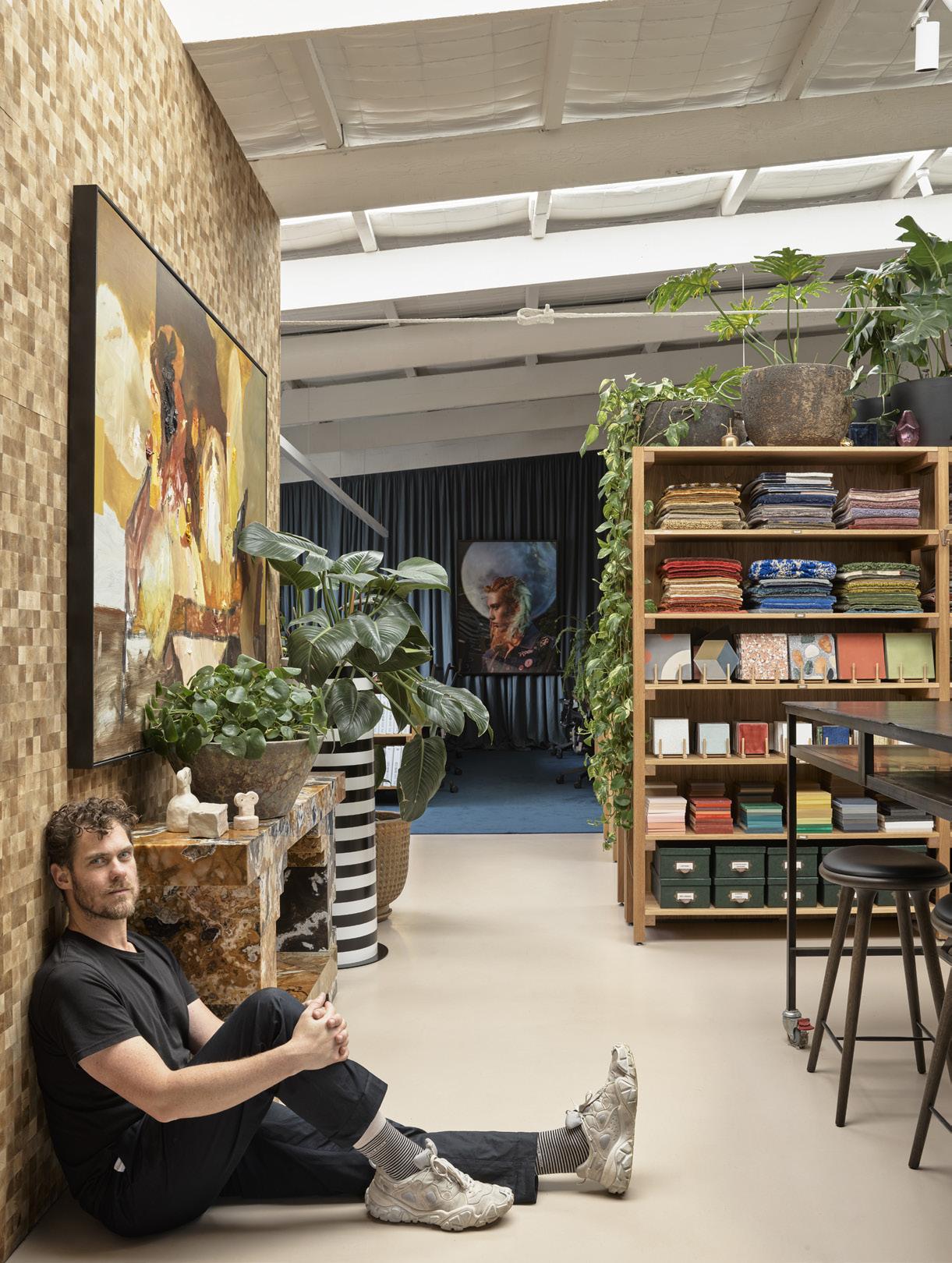
At Home with:
Alex Seton
WHERE DO YOU CALL HOME?
AS/ I’ve lived and worked in Newtown since 2002 - I adore this little nook of the world. It has changed a lot in that time but has retained a sense of local community.
DO YOU CONSIDER YOURSELF A COLLECTOR?
AS/ Yes. While I’ve had the benefit of artist swaps, I tend not to be able to help myself when I walk into an exhibition and see something that leaps out at me! Only recently, I realised that I have more than 200 works… there’s still plenty more room left on the ceiling though!
WHAT ARE YOU COOKING FOR DINNER TONIGHT?
AS/ Salmon yellow curry with coriander, cashews and sesame wrapped with soft tortilla tacos, stuffed with wild coconut rice and mango salsa. With more coriander. I really enjoy cooking, and weirdly, this meal has been one of my more successful experiments!
WHAT ARE YOU WATCHING/READING/LISTENING TO RIGHT NOW?
AS/ Dancing with Strangers written by Inga Clendinnen tells of the first night of the first fleet when Europeans and Indigenous Australians danced together. Kim Mahood’s Position Unknown is another recent read. I’m really into Australian writers who speak to our various different relationships with the land. I’ve been listening to Sofi Tukker’s album Treehouse and I can’t get Paténipat by Charlotte Adigéry out of my head both high energy and great to carve to!
DO YOU HAVE A MARBLE BATHROOM?
AS/ Nope - all wood and tile! I recommend marble only for artworks.
DO YOU HAVE A GREEN THUMB?
AS/ Yes, I have a splendid urban jungle garden that suffers neglect as shows draw closer. I have five different types of fig, which brings me a stupid amount of pleasure!
+ TO SEE AVAILABLE WORKS BY ALEX SETON, ACCESS THE
OCTOBER 2020
VIEWING ROOM BY ENTERING YOUR EMAIL ADDRESS
Alex Seton at home. Photography credit: Vasili Vasileiadis
51
OCTOBER 2020
Alex Seton Proposal For a Humble Monument, 2020 Molong marble 120 x 86 x 77 cm Photography credit: Mark Pokorny Wynne Prize finalist (detail on right)
53
In the Studio:
Sam Jinks
CAN YOU DESCRIBE YOUR STUDIO? IS THERE ANYTHING
YOUR WORKS TAKE A LONG TIME TO MAKE, FROM
ARCHITECTURALLY SPECIAL ABOUT IT?
CONCEPT TO THE PERFECT FINISHED DETAILS. WHICH IS
SJ/ The studio is a double storey warehouse building, with a large roller door and concrete floor downstairs and a carpeted clean area upstairs. Downstairs is where I make a mess - sculpt, make molds, paint, etc. There are a few different benches with work at various stages, there are plenty of tools and machines, a fume cupboard, some plants, my beloved Cutler roll top desk and a kitchen area. Upstairs is where I do admin, sketching, hair punching, 3D scanning and printing. I also have a lot of maquettes upstairs, and also a couch for naps. It’s very peaceful up there, unless the kids are visiting, and then it’s noisy and covered in crumbs!
THE MOST ENJOYABLE PART OF CREATION? AND WHICH IS THE MOST DIFFICULT?
SJ/ The sculpting stage is my favourite, capturing the form of the work in monochromatic grey clay. It’s very painstaking, I often re-sculpt parts many times to get them right, and if it’s winter, the clay can be very hard and difficult to work with. As for the most difficult part, the painting is very tedious, as I’m stuck in the fume cupboard wearing a mask, so it’s also quite taxing. Rigging and finishing work is a pain, there’s a lot of unknowns to solve, a lot of wrestling on the floor trying to get everything together.
DO YOU HAVE ASSISTANTS? IS THERE ROOM FOR
DOES YOUR RELATIONSHIP TO A WORK CHANGE AFTER
EVERYONE? DO YOU PREFER WORKING ON YOUR OWN
IT IS FINISHED AND YOU SEE IT IN A MUSEUM?
OR WITH OTHERS?
SJ/ I prefer to work alone, but occasionally I need to get someone in to help. I like to make sure everyone has their own personal space, so we’re not working on the same thing side by side. Lately I’ve been able to work with some great technicians who have their own studio space, so they can take some work there to finish.
SJ/ Of course, you never really get to see the work completed until it’s left the studio. You have to shut down your senses in a way to get it finished, and it’s a mad scramble to get it into the crate while the couriers are waiting. In a museum or gallery, I still need to finesse a few details, the hair and lighting,W etc. But then to finally stand back, to see the way visitors react, is another life for the work, beyond my studio.
YOU WORK WITH A LOT OF CHEMICALS – HAS THIS EVER
OCTOBER 2020
HAMPERED YOUR HEALTH?
SJ/ Many of the materials I use are quite benign, silicone for example, but I’ve always been very careful with solvents. I built a fume cupboard for mixing noxious materials, I also use it when I’m painting, as aerosolised particles are very small. I also use a Sundstrom mask and filter. Clay dust can also be dangerous, as its easily inhaled and can lead to silicosis.
+ TO SEE AVAILABLE WORKS BY SAM JINKS, ACCESS THE VIEWING ROOM BY ENTERING YOUR EMAIL ADDRESS
Sam Jinks working on Iris - the messenger, 2018 in his studio
Sam Jinks in his studio Photography credit: Daniel Shipp
55
Quick Curate:
Reverie
Lindy Lee gentle rain, 2017 paper, fire, rain and Chinese ink 76 x 57 cm AUD $7,700
OCTOBER 2020
Angela Tiatia Dark Light, 2017 pigment print 104 x 215 cm AUD $7,700
Tim Silver Untitled Object (Cedar Timbermate Woodfiller) 2012 archival inkjet print on canson satin paper 80 x 200 cm 5 plus 2 AP AUD $8,800
Polly Borland Head, 2016 archival pigment print 100 x 80 cm AUD $9,900
Tim Silver Untitled (Oneirophrenia) (blue) #1, 2015 pure white concrete, marble dust and pigment 38.5 x 24 x 26 cm AUD $16,500
57
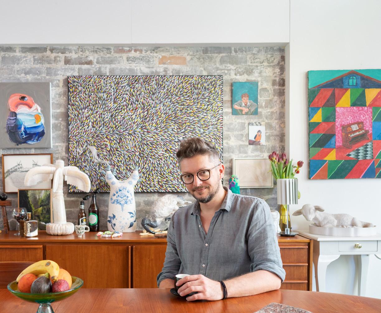
Last Word:
David Flack The Next Right Thing
2020 was always going to be a big year for our studio, however, every event, idea and opportunity we had our sights on seemed to evaporate in March. My sister has worked within disease management, so I knew the reality of Covid-19. I also watched the devastating affect the virus was having on Milan, a city I visit every year and hold very dear to my creative process. This was something we would live through for a minimum of 18 months, followed by a very deep and long recession. This was my fear talking. In this moment of fear, I was able to think about the hospitality, events and art-based industries who were effectively shut down without any visibility of their future. Via our Instagram, I began to promote local businesses for hospitality and artists, who very quickly worked out creative ways to maintain employment for themselves and their teams. There was no thought process, it was just an instinct and the right thing to do.
OCTOBER 2020
As the weeks began to roll past and lockdown continued, I began devouring any doco or film related to disease control, while also binging on politics, climate change and films breaking down the largest social movement the world has seen with Black Lives Matter, it was hard not to be depressed and focus on a bleak future. One afternoon, I needed something fresh and disconnected from our collapsing world. I stumbled across a documentary on the making for Frozen 2. Yes, I needed something that drastically removed. It turned out to be my biggest epiphany during 2020, and I’ve had a few.
It was quite revealing of the art process, and within moments I was excited for not only my creative future, but our ability as humans to solve the most complex of problems in a human manner. During the writing process of Frozen 2, the director Chris Buck tragically lost his adult son. He took that darkness and light into the creation of the film. In the doco, Buck openly talks about his depression, resulting in his inability to get out of bed. He was confronted with two options; follow the darkness or do one thing that will lead him in the opposite direction of fear. In this case it was getting out of bed, the next thing was to make his bed, followed by a drink of water. Very simple ideas, however in the pace of pre-2020, we somehow forgot to live in the moment and do what was instinctively right, regardless of how insignificant that action may seem. There is a scene in the film where the main protagonist ‘Ana’ has her darkest moment and she sings about her depression. It wasn’t a moment I was expecting from a Disney princess film; but it was a simple message I needed in a moment surrounded by dread; I've seen dark before, but not like this - This is cold, this is empty, this is numb - The life I knew is over, the lights are out - Hello, darkness, I'm ready to succumb - I follow you around, I always have - But you've gone to a place I cannot find - This grief has a gravity, it pulls me down - But a tiny voice whispers in my mind - You are lost, hope is gone - But you must go on - And do the next right thing.
David Flack Photography credit: Anson Smart Artwork and ceramics by Karen Black and Darren Sylvester
59
Last Word: David Flack
The next right thing for Ana, is to pull herself up from the floor and place one foot in front of the other. With the knowledge of Buck’s experience, I realised that we all unconsciously either make choices walking towards fear or step away from it. I sometimes have been known to do both, however, these days when the choice comes my way, I find myself singing this song.
Art is transformative and we need to start listening to the stories around us, rather than seeing them as content. Art has always been the most important part our lives, however, I now have renewed excitement of the world I want to live in and create through my work, one that embraces art in all its forms, as the answer has always been through honest human storytelling.
It makes us realise how important storytelling is and the important position artists hold within our communities. I’m now focused on the positive impact artists play on my day-to-day life – far greater than my phone or the media who both fight to stoke my fears for financial gain. In this epiphany I owned my own story telling within my work. I tell stories in the homes I design, using spatial planning, materiality, detail, texture, furniture and art to set the experience and world of my clients.
I set up Flack Studio in 2014, and after only four years in the industry, I was still considered a junior. I felt the industry was too commercial and was not fulfilling my creative dreams. So, I had a choice; leave the design world and start a new career or create the world I wanted within interior architecture, one that engaged and collaborated with art. The latter was the hardest at the time, but its rewards have been endless.
OCTOBER 2020
I start my process with art, well before I’ve designed the floorplan. I focus on the art and sculpture that will help me tell the home’s narrative. Whether it be Karen Black, Michael Lindeman, Ramesh Mario Nithiyendran or Darren Sylvester, the voice and storytelling abilities of these artists inspire the creations of my works. I think everyone is clear that a return to the world we had pre-Covid is not the future we want for ourselves or our children. However, what is it that we want? We’ve shown in the last year how quickly our environment can heal itself and how our governments can look after our most vulnerable, we’ve also seen the corners cut to save a dime in industries like aged care.
So again, I did the next right thing and set up my studio with the intention of bridging the divide to make interior design/architecture an artform. When designing the studio you see pictured, I saw it as a gallery with the intent of making it a space that invited people into the world of interior architecture as an artform. I’m excited by our future and know it will be one that celebrates voice and story, as it’s been the art of story that’s protected us during this pandemic and social shift. My next right thing is to submit this to Sullivan+Strumpf as it’s already a day late and then I’m taking my dogs Frank and Alfred for a walk.
Photography credit: Anson Smart Artwork by Dane Lovett
61
OCTOBER 2020
Photography credit: Anson Smart Artwork by Glenn Barkley and Ry David Bradley
63
OCTOBER 2020
Photography credit: Anson Smart Artwork by Kirsten Coelho
Photography credit: Anson Smart Artwork by Ramesh Mario Nithiyendran
65
Upcoming Exhibitions
MICHAEL ZAVROS A GUY LIKE ME 15.10.20
OCTOBER 2020
ALEX SETON MEET ME UNDER THE DOME 26.11.20
Lindy Lee: Moon in a Dew Drop
Opens 2 October 2020 A major survey exhibition by influential Australian artist Lee looks at art history, cultural authenticity, identity and our relationship to the cosmos.
Lindy Lee, Unnameable , 2017, mirror polished bronze, image courtesy the artist and Sullivan+Strumpf, Sydney
Exhibition Strategic Sponsor
Exhibition Major Partner
Exhibition Supporting Partner
Exhibition Patrons
GRANTPIRRIE Private
Supporting Exhibition Patrons
Susan Rothwell
Gutman Family Foundation & Jon Nicholson
Government Partners
SYDNEY 799 Elizabeth St Zetland, Sydney NSW 2017 Australia P +61 2 9698 4696 E art@sullivanstrumpf.com
SINGAPORE 5 Lock Road #01-06 108933 Singapore P +65 8310 7529 E art@sullivanstrumpf.com
Below the mountains and beyond the desert, a river runs through a valley of forests and grasslands towards an ocean GRANT STEVENS art.uts.edu.au
Date 2020 Location UTS Broadway Screen commission